ArkUI Progress进度条组件用法详解(附带实例)
Progress 是一种进度条显示组件,用于显示目标操作的当前进度。
创建进度条的示例代码如下:

图 1 进度条显示效果
默认类型为 ProgressType.Linear。
从 API version9 开始,当组件的高度大于宽度时,组件会自适应垂直显示;当组件的高度等于宽度时,组件保持水平显示。
1) 线性样式进度条的示例代码如下:
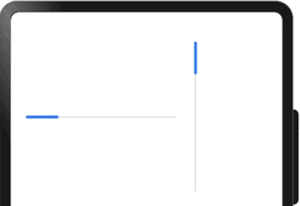
图 2 直线样式进度条显示效果
2) 环形无刻度样式进度条的示例代码如下:
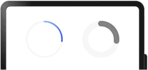
图 3 环形无刻度样式进度条显示效果
3) 环形有刻度样式进度条的示例代码如下:
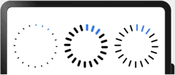
图 4 环形有刻度样式进度条显示效果
4) 圆形样式进度条的示例代码如下:
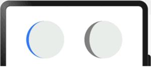
图 5 圆形样式进度条显示效果
5) 胶囊样式进度条的示例代码如下:
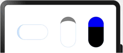
图 6 胶囊样式进度条显示效果
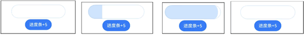
图 7 点击按钮更新进度条值的显示效果
ArkUI创建进度条
Progress 通过调用接口来创建,接口调用形式如下:
Progress(options: {value: number, total?: number, type?: ProgressType})
其中,value 用于设置初始进度值,total 用于设置进度总长度,type 用于设置 Progress 样式。创建进度条的示例代码如下:
@Entry
@Component
struct ProgressSample {
    build() {
        Row() {
            // 创建一个进度总长为100,初始进度值为24的线性进度条
            Progress({ value: 24, total: 100, type: ProgressType.Linear })
        }.margin({ left: 20, right: 20 })
    }
}
显示效果如下图所示:图 1 进度条显示效果
ArkUI设置进度条样式
通过 ProgressType 可以设置进度条样式,ProgressType 类型包括:- ProgressType.Linear:线性样式;
- ProgressType.Ring:环形无刻度样式;
- ProgressType.ScaleRing:环形有刻度样式;
- ProgressType.Eclipse:圆形样式;
- ProgressType.Capsule:胶囊样式。
默认类型为 ProgressType.Linear。
从 API version9 开始,当组件的高度大于宽度时,组件会自适应垂直显示;当组件的高度等于宽度时,组件保持水平显示。
1) 线性样式进度条的示例代码如下:
@Entry
@Component
struct ProgressSample {
    build() {
        Row() {
            // 进度条组件,设置当前进度值为20,总进度长度为100,将进度条样式设置为直线
            // 设置进度条的宽度大于高度,进度条水平显示
            Progress({ value: 20, total: 100, type: ProgressType.Linear }).width(200).height(50)
            // 进度条组件,设置当前进度值为20,总进度长度为100,将进度条样式设置为直线
            // 设置进度条的高度大于宽度,进度条垂直显示
            Progress({ value: 20, total: 100, type: ProgressType.Linear }).width(50).height(200)
        }.width('100%').padding({ left: 20, right: 20 })
    }
}
显示效果如下图所示:图 2 直线样式进度条显示效果
2) 环形无刻度样式进度条的示例代码如下:
@Entry
@Component
struct ProgressSample {
    build() {
        Row() {
            // 从左往右,1号环形进度条,默认前景色为蓝色渐变,默认strokeWidth进度条宽度为2vp
            Progress({ value: 40, total: 150, type: ProgressType.Ring }).width(100).height(100)
            // 从左往右,2号环形进度条
            Progress({ value: 40, total: 150, type: ProgressType.Ring }).width(100).height(100)
                // 进度条前景色为灰色
                .color(Color.Grey)
                // 设置strokeWidth进度条宽度为15vp
                .style({ strokeWidth: 15})
        }
    }
}
显示效果如下图所示:图 3 环形无刻度样式进度条显示效果
3) 环形有刻度样式进度条的示例代码如下:
@Entry
@Component
struct ProgressSample {
    build() {
        Row() {
            Progress({ value: 20, total: 150, type: ProgressType.ScaleRing }).width(100).height(100)
                .backgroundColor(Color.Black)
                // 设置环形有刻度进度条总刻度数为 20,刻度宽度为 5vp
                .style({ scaleCount: 20, scaleWidth: 5 })
            Progress({ value: 20, total: 150, type: ProgressType.ScaleRing }).width(100).height(100)
                .backgroundColor(Color.Black)
                // 设置环形有刻度进度条宽度为 15vp,总刻度数为 20,刻度宽度为 5vp
                .style({ strokeWidth: 15, scaleCount: 20, scaleWidth: 5 })
            Progress({ value: 20, total: 150, type: ProgressType.ScaleRing }).width(100).height(100)
                .backgroundColor(Color.Black)
                // 设置环形有刻度进度条宽度为 15vp,总刻度数为 20,刻度宽度为 3vp
                .style({ strokeWidth: 15, scaleCount: 20, scaleWidth: 3 })
        }.width('100%').justifyContent(FlexAlign.SpaceEvenly)
    }
}
显示效果如下图所示:图 4 环形有刻度样式进度条显示效果
4) 圆形样式进度条的示例代码如下:
@Entry
@Component
struct ProgressSample {
    build() {
        Row() {
            // 圆形进度条,默认前景色为蓝色
            Progress({ value: 10, total: 150, type: ProgressType.Eclipse })
                .width(100).height(100)
            // 圆形进度条,指定前景色为灰色
            Progress({ value: 20, total: 150, type: ProgressType.Eclipse })
                .color(Color.Grey).width(100).height(100)
        }.width('100%').justifyContent(FlexAlign.SpaceEvenly)
    }
}
显示效果如下图所示:图 5 圆形样式进度条显示效果
5) 胶囊样式进度条的示例代码如下:
@Entry
@Component
struct ProgressSample {
    build() {
        Row() {
            Progress({ value: 10, total: 150, type: ProgressType.Capsule })
                .width(100).height(50)
            Progress({ value: 20, total: 150, type: ProgressType.Capsule })
                .width(50).height(100).color(Color.Grey)
            Progress({ value: 50, total: 150, type: ProgressType.Capsule })
                .width(50).height(100).color(Color.Blue).backgroundColor(Color.Black)
        }.width('100%').justifyContent(FlexAlign.SpaceEvenly)
    }
}
显示效果如下图所示:图 6 胶囊样式进度条显示效果
ArkUI Progress场景示例
下面实例中,实现通过点击按钮更新进度条的值,同时刷新进度条显示效果。该场景一般多用于文件的下载、上传或应用程序的安装。
@Entry
@Component
struct ProgressCase1 {
    @State progressValue: number = 0

    // 设置进度条初始值为 0
    build() {
        Column() {
            Column() {
                Progress({ value: 0, total: 100, type: ProgressType.Capsule })
                    .width(200).height(50).value(this.progressValue)
                Row().width('100%').height(5)
                Button("进度条+5")
                .onClick(() => {
                    this.progressValue += 5
                    if (this.progressValue > 100) {
                        this.progressValue = 0
                    }
                })
            }
        }.width('100%').height('100%')
    }
}
显示效果如下图所示:图 7 点击按钮更新进度条值的显示效果