ArkUI相对布局(RelativeContainer)详解(附带实例)
在应用的开发过程中,经常需要设计复杂界面,此时会涉及多个相同或不同组件之间的嵌套。如果布局组件嵌套深度过深,或嵌套组件数量过多,就会带来额外的性能开销。因此,需要在布局的方式上进行优化,以提升性能并减少时间开销。
RelativeContainer 是采用相对布局的容器,支持容器内部子元素设置的相对位置关系,适用于在界面复杂的场景中对多个子组件进行对齐和排列。子元素可以指定兄弟元素或父容器作为锚点,并基于锚点进行相对位置布局。
下图所示是一个 RelativeContainer 的概念图,图中的虚线表示位置的依赖关系。
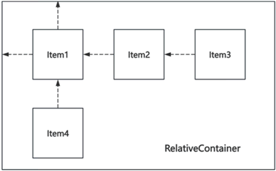
图 1 相对布局示意图
子元素的依赖关系不一定完全如图 1 所示。比如,Item4 可以将 Item2 作为依赖锚点,也可以将 RelativeContainer 父容器作为依赖锚点。
这里先介绍 2 个基本概念:
在水平方向上,可以设置 left、middle、right 的锚点;在竖直方向上,可以设置 top、center、bottom 的锚点。
为了明确定义锚点,必须为 RelativeContainer 及其子元素设置 ID,以指定锚点信息。默认情况下,RelativeContainer 的 ID 为 __container__,其他子元素的 ID 需要通过 id 属性显式设置。未设置 ID 的组件仍可显示,但无法作为其他子组件的锚点。
对于未设置 ID 的组件,相对布局容器会自动为其生成一个 ID,但该 ID 的命名规则无法被外部应用感知。在涉及互相依赖或环形依赖时,容器内的所有子组件将无法绘制。同一方向上,如果有两个或以上的位置设置了锚点,并且锚点位置逆序时,相关子组件的大小将被设为 0,即不进行绘制。
在使用锚点时,要注意子元素的相对位置关系,避免出现错位或遮挡的情况。
以 RelativeContainer 父组件为锚点的相对布局示例代码如下:
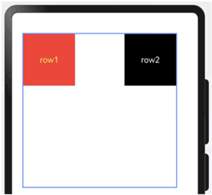
图 2 以父组件为锚点的相对布局显示效果
以兄弟元素为锚点的相对布局示例代码如下:
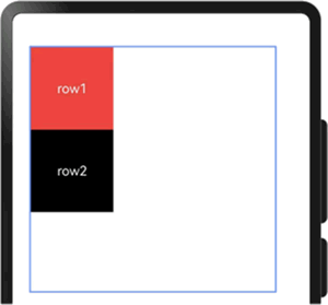
图 3 以兄弟元素为锚点的相对布局显示效果
当以子组件为锚点时,子组件可以任意选择,但需注意不要相互依赖,示例代码如下:
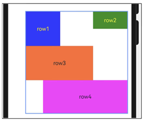
图 4 使用子组件锚点的显示效果
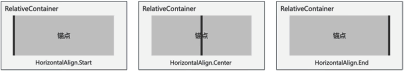
图 5 水平方向上锚点的对齐位置
在竖直方向上,对齐位置可以设置为 VerticalAlign.Top、VerticalAlign.Center、VerticalAlign.Bottom,如下图所示,图中的黑线表示锚点。
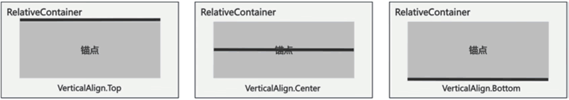
图 6 竖直方向上锚点的对齐位置
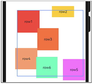
图 7 使用子组件位置偏移后的显示效果
RelativeContainer 是采用相对布局的容器,支持容器内部子元素设置的相对位置关系,适用于在界面复杂的场景中对多个子组件进行对齐和排列。子元素可以指定兄弟元素或父容器作为锚点,并基于锚点进行相对位置布局。
下图所示是一个 RelativeContainer 的概念图,图中的虚线表示位置的依赖关系。
图 1 相对布局示意图
子元素的依赖关系不一定完全如图 1 所示。比如,Item4 可以将 Item2 作为依赖锚点,也可以将 RelativeContainer 父容器作为依赖锚点。
这里先介绍 2 个基本概念:
- 锚点:通过锚点设置当前元素基于哪个元素确定位置。
- 对齐方式:通过对齐方式设置当前元素是基于锚点的上中下对齐,还是基于锚点的左中右对齐。
锚点设置
锚点设置是指设置子元素相对于父元素或兄弟元素的位置依赖关系。在水平方向上,可以设置 left、middle、right 的锚点;在竖直方向上,可以设置 top、center、bottom 的锚点。
为了明确定义锚点,必须为 RelativeContainer 及其子元素设置 ID,以指定锚点信息。默认情况下,RelativeContainer 的 ID 为 __container__,其他子元素的 ID 需要通过 id 属性显式设置。未设置 ID 的组件仍可显示,但无法作为其他子组件的锚点。
对于未设置 ID 的组件,相对布局容器会自动为其生成一个 ID,但该 ID 的命名规则无法被外部应用感知。在涉及互相依赖或环形依赖时,容器内的所有子组件将无法绘制。同一方向上,如果有两个或以上的位置设置了锚点,并且锚点位置逆序时,相关子组件的大小将被设为 0,即不进行绘制。
在使用锚点时,要注意子元素的相对位置关系,避免出现错位或遮挡的情况。
以 RelativeContainer 父组件为锚点的相对布局示例代码如下:
// 相对布局规则设置
let AlignRus: Record<string, Record<string, string | VerticalAlign | HorizontalAlign>> = {
  // 顶部相对于容器顶部对齐
  top:   { anchor: '__container__', align: VerticalAlign.Top },
  // 左侧相对于容器左对齐
  left:  { anchor: '__container__', align: HorizontalAlign.Start }
};

// 相对布局规则设置
let AlignRue: Record<string, Record<string, string | VerticalAlign | HorizontalAlign>> = {
  // 顶部相对于容器顶部对齐
  top:   { anchor: '__container__', align: VerticalAlign.Top },
  // 右侧相对于容器右对齐
  right: { anchor: '__container__', align: HorizontalAlign.End }
};

// 通过 Record 类型数据设置外边距参数
let MLeft: Record<string, number> = { left: 20 };

// 通过 Record 类型数据设置边框参数
let BWC: Record<string, number | string> = { width: 2, color: '#6699FF' };

@Entry
@Component
struct Index {
  build() {
    // 相对布局容器,默认 id 为 __container__
    RelativeContainer() {
      Row() {
        Text('row1')
          .fontColor(Color.Yellow)
          // 子组件在水平方向居中对齐
          .justifyContent(FlexAlign.Center)
          .width(100)
          .height(100)
          .backgroundColor('#FF3333')
          // 设置相对布局参数
          .alignRules(AlignRus)
          // 组件 id 为 row1
          .id('row1')
      }

      Row() {
        Text('row2')
          .fontColor(Color.White)
          // 设置子组件在水平方向居中对齐
          .justifyContent(FlexAlign.Center)
          .width(100)
          .height(100)
          .backgroundColor('#000000')
          // 设置相对布局参数
          .alignRules(AlignRue)
          // 组件 id 为 row2
          .id('row2')
      }
    }
    .width(300)
    .height(300)
    // 设置外边距布局参数
    .margin(MLeft)
    // 设置边框布局参数
    .border(BWC)
  }
}
显示效果如下图所示:图 2 以父组件为锚点的相对布局显示效果
以兄弟元素为锚点的相对布局示例代码如下:
// 设置相对布局规则:row1 相对于容器
let AlignRus: Record<string, Record<string, string | VerticalAlign | HorizontalAlign>> = {
  // 顶部相对于容器顶部对齐
  'top':  { 'anchor': '__container__', 'align': VerticalAlign.Top },
  // 左侧相对于容器左侧对齐
  'left': { 'anchor': '__container__', 'align': HorizontalAlign.Start }
};

// 设置相对布局规则:row2 相对于 row1
let RelConB: Record<string, Record<string, string | VerticalAlign | HorizontalAlign>> = {
  // 顶部相对于 row1 元素底部对齐
  'top':  { 'anchor': 'row1', 'align': VerticalAlign.Bottom },
  // 左侧相对于 row1 元素左对齐
  'left': { 'anchor': 'row1', 'align': HorizontalAlign.Start }
};

// 通过 Record 类型数据设置外边距参数
let MLeft: Record<string, number> = { left: 20 };

// 通过 Record 类型数据设置边框参数
let BWC: Record<string, number | string> = { width: 2, color: '#6699FF' };

@Entry
@Component
struct Index {
  build() {
    // 相对布局容器,默认 ID 为 __container__
    RelativeContainer() {
      Row() {
        Text('row1')
          .fontColor(Color.White)
          // 子组件在水平方向居中对齐
          .justifyContent(FlexAlign.Center)
          .width(100)
          .height(100)
          .backgroundColor('#FF3333')
          // 设置相对布局规则
          .alignRules(AlignRus)
          // 组件 ID 为 row1
          .id('row1')
      }

      // row2
      Row() {
        Text('row2')
          .fontColor(Color.White)
          // 子组件在水平方向居中对齐
          .justifyContent(FlexAlign.Center)
          .width(100)
          .height(100)
          .backgroundColor(Color.Black)
          // 设置相对布局规则
          .alignRules(RelConB)
          // 组件 ID 为 row2
          .id('row2')
      }
    }
    .width(300)
    .height(300)
    // 设置外边距参数
    .margin(MLeft)
    // 设置边框参数
    .border(BWC)
  }
}
显示效果如下图所示:图 3 以兄弟元素为锚点的相对布局显示效果
当以子组件为锚点时,子组件可以任意选择,但需注意不要相互依赖,示例代码如下:
@Entry
@Component
struct Index {
  build() {
    // 相对布局容器,默认 id 为 __container__
    RelativeContainer() {
      // ===== Row1 =====
      Row() {
        Text('row1')
          .fontColor(Color.Yellow)
          // 子组件在水平方向居中对齐
          .justifyContent(FlexAlign.Center)
          .width(100)
          .height(100)
          .backgroundColor('#ff3339ff')
          // 相对布局规则:顶部相对于父组件垂直方向顶部对齐
          // 左侧相对于父组件水平方向左对齐
          .alignRules({
            top:  { anchor: '__container__', align: VerticalAlign.Top },
            left: { anchor: '__container__', align: HorizontalAlign.Start }
          })
          // 组件 ID 为 row1
          .id('row1')
      }

      Row() {
        Text('row2')
          .fontColor(Color.Yellow)
          .justifyContent(FlexAlign.Center)
          .width(100)
          .height(100)
          .backgroundColor('#ff298e1e')
          // 相对布局规则:
          .alignRules({
            // 1) 顶部相对于父组件垂直方向顶部对齐
            top:    { anchor: '__container__', align: VerticalAlign.Top },
            // 2) 右侧相对于父组件水平方向右对齐
            right:  { anchor: '__container__', align: HorizontalAlign.End },
            // 3) 底部相对于 row1 元素垂直方向居中对齐(row2 底部对齐 row1 中间)
            bottom: { anchor: 'row1',        align: VerticalAlign.Center }
          })
          // 组件 ID 为 row2
          .id('row2')
      }

      Row() {
        Text('row3')
          .justifyContent(FlexAlign.Center)
          .height(100)
          .backgroundColor('#ffff6a33')
          // 相对布局规则:
          .alignRules({
            // 1) 顶部相对于 row1 底部对齐
            top:   { anchor: 'row1', align: VerticalAlign.Bottom },
            // 2) 左侧相对于 row1 左对齐
            left:  { anchor: 'row1', align: HorizontalAlign.Start },
            // 3) 右侧相对于 row2 左对齐
            right: { anchor: 'row2', align: HorizontalAlign.Start }
          })
          // 组件 ID 为 row3
          .id('row3')
      }

      Row() {
        Text('row4')
          .justifyContent(FlexAlign.Center)
          .backgroundColor('#ffff33fd')
          // 相对布局规则:
          .alignRules({
            // 1) 顶部对齐 row3 的底部
            top:    { anchor: 'row3',        align: VerticalAlign.Bottom },
            // 2) 左侧对齐 row1 的中间
            left:   { anchor: 'row1',        align: HorizontalAlign.Center },
            // 3) 右侧对齐 row2 的右边
            right:  { anchor: 'row2',        align: HorizontalAlign.End },
            // 4) 底部对齐容器的底部
            bottom: { anchor: '__container__', align: VerticalAlign.Bottom }
          })
          // 组件 ID 为 row4
          .id('row4')
      }
    }
    .width(300)
    .height('100%')      // 修正图片中高度符号为 '100%'
    // 设置外边距参数
    .margin({ left: 50 })
    // 设置边框参数
    .border({ width: 2, color: '#6699FF' })
  }
}
显示效果如下图所示:图 4 使用子组件锚点的显示效果
设置相对于锚点的对齐位置
设置了锚点之后,可以通过 align 属性设置相对于锚点的对齐位置。在水平方向上,对齐位置可以设置为 HorizontalAlign.Start、HorizontalAlign.Center、HorizontalAlign.End,如下图所示,图中的黑线表示锚点。图 5 水平方向上锚点的对齐位置
在竖直方向上,对齐位置可以设置为 VerticalAlign.Top、VerticalAlign.Center、VerticalAlign.Bottom,如下图所示,图中的黑线表示锚点。
图 6 竖直方向上锚点的对齐位置
子组件位置偏移
子组件经过相对位置对齐后,此时的位置可能还不是目标位置,开发者可根据需要使用 offset 属性进行额外的偏移设置,示例代码如下:
@Entry
@Component
struct Index {
  build() {
    // 相对布局容器,默认 id 为 __container__
    RelativeContainer() {
      // ===== Row1 =====
      Row() {
        Text('row1')
          .justifyContent(FlexAlign.Center)
          .width(100)
          .height(100)
          .backgroundColor('#FF3333')
          // 相对布局规则:顶部与容器的顶部对齐,左侧与容器的左侧对齐
          .alignRules({
            top:  { anchor: '__container__', align: VerticalAlign.Top },
            left: { anchor: '__container__', align: HorizontalAlign.Start }
          })
          // 组件 ID
          .id('row1')
      }

      // ===== Row2 =====
      Row() {
        Text('row2')
          .justifyContent(FlexAlign.Center)
          .width(100)
          .height(100)
          .backgroundColor('#FFCC00')
          // 相对布局规则:
          .alignRules({
            // 顶部与容器的顶部对齐
            top:    { anchor: '__container__', align: VerticalAlign.Top },
            // 右侧与容器的右侧对齐
            right:  { anchor: '__container__', align: HorizontalAlign.End },
            // 底部与 row1 的垂直方向中间对齐
            bottom: { anchor: 'row1',          align: VerticalAlign.Center }
          })
          // 在原本的位置上,x 轴方向左移 40 vp,y 轴方向上移 20 vp
          .offset({ x: -40, y: -20 })
          .id('row2')
      }

      // ===== Row3 =====
      Row() {
        Text('row3')
          .justifyContent(FlexAlign.Center)
          .width(100)          // 宽度在 12.jpg 已出现
          .height(100)
          .backgroundColor('#FF6633')
          // 相对布局规则:
          .alignRules({
            // 顶部与 row1 的底部对齐
            top:   { anchor: 'row1', align: VerticalAlign.Bottom },
            // 左侧与 row1 的右侧对齐
            left:  { anchor: 'row1', align: HorizontalAlign.End },
            // 右侧与 row2 的左边对齐
            right: { anchor: 'row2', align: HorizontalAlign.Start }
          })
          // 在原本的位置上,x 轴方向左移 10 vp,y 轴方向上移 20 vp
          .offset({ x: -10, y: -20 })
          .id('row3')
      }

      // ===== Row4 =====
      Row() {
        Text('row4')
          .justifyContent(FlexAlign.Center)
          .width(100)   // 隐含宽度,补全保持一致
          .height(100)
          .backgroundColor('#FF9966')
          // 相对布局规则:
          .alignRules({
            // 顶部与 row3 的底部对齐
            top:    { anchor: 'row3',          align: VerticalAlign.Bottom },
            // 底部与容器的底部对齐
            bottom: { anchor: '__container__', align: VerticalAlign.Bottom },
            // 左边与容器的左边对齐
            left:   { anchor: '__container__', align: HorizontalAlign.Start },
            // 右边与 row1 的右边对齐
            right:  { anchor: 'row1',          align: HorizontalAlign.End }
          })
          // 在原本的位置上,x 轴方向左移 10 vp,y 轴方向上移 30 vp
          .offset({ x: -10, y: -30 })
          .id('row4')
      }

      // ===== Row5 =====
      Row() {
        Text('row5')
          .justifyContent(FlexAlign.Center)
          .width(100)   // 隐含宽度,补全保持一致
          .height(100)
          .backgroundColor('#FF66FF')
          // 相对布局规则:
          .alignRules({
            // 顶部与 row3 的底部对齐
            top:    { anchor: 'row3',          align: VerticalAlign.Bottom },
            // 底部与容器的底部对齐
            bottom: { anchor: '__container__', align: VerticalAlign.Bottom },
            // 左边与 row2 的左边对齐
            left:   { anchor: 'row2',          align: HorizontalAlign.Start },
            // 右边与 row2 的右边对齐
            right:  { anchor: 'row2',          align: HorizontalAlign.End }
          })
          // 在原本的位置上,x 轴方向右移 10 vp,y 轴方向下移 20 vp
          .offset({ x: 10, y: 20 })
          .id('row5')
      }

      // ===== Row6 =====
      Row() {
        Text('row6')
          .justifyContent(FlexAlign.Center)
          .width(100)
          .height(100)
          .backgroundColor('#ff33ffb5')
          // 相对布局规则:
          .alignRules({
            // 顶部与 row3 的底部对齐
            top:    { anchor: 'row3',  align: VerticalAlign.Bottom },
            // 底部与 row4 的底部对齐
            bottom: { anchor: 'row4',  align: VerticalAlign.Bottom },
            // 左边与 row3 的左边对齐
            left:   { anchor: 'row3',  align: HorizontalAlign.Start },
            // 右边与 row3 的右边对齐
            right:  { anchor: 'row3',  align: HorizontalAlign.End }
          })
          // 在原本的位置上,x 轴方向左移 15 vp,y 轴方向下移 10 vp
          .offset({ x: -15, y: 10 })
          // 背景图位置与尺寸示例
          .backgroundImagePosition(Alignment.Bottom)
          .backgroundImageSize(ImageSize.Cover)
          .id('row6')
      }
    }
    .width(300)
    .height('100%')          // 修正图片中的全角/错误引号
    .margin({ left: 50 })
    .border({ width: 2, color: '#6699FF' })
  }
}
显示效果如下图所示:图 7 使用子组件位置偏移后的显示效果
 ICP备案:
 公安联网备案: