ArkUI栅格布局(GridRow和GridCol)详解(附带实例)
栅格布局是一种通用的辅助定位工具,对移动设备的界面设计有较好的借鉴作用。其主要优势包括:
GridRow 为栅格容器组件,需要与栅格子组件 GridCol 在栅格布局场景中联合使用。
栅格系统默认断点将设备宽度分为 xs、sm、md、lg 四类,如下表所示。
在 GridRow 栅格组件中,允许开发者使用 breakpoints 自定义断点的取值范围,最多支持 6 个断点,除了默认的 4 个断点外,还可以启用 xl、xxl 两个断点,总共支持 6 种不同尺寸(xs, sm, md, lg, xl, xxl)设备的布局设置,如下表所示。
针对断点位置,开发者可以根据实际使用场景,通过一个单调递增数组来进行设置。由于 breakpoints 最多支持 6 个断点,因此单调递增数组的最大长度为 5。例如:
又如:
栅格系统通过监听窗口或容器的尺寸变化进行断点,通过 reference 设置断点切换参考物。考虑到应用可能以非全屏窗口的形式显示,因此以应用窗口宽度为参照物更为通用。
例如,使用栅格的默认列数(12 列),通过断点设置将应用宽度分成 6 个区间,在各区间中,每个栅格子元素占用的列数均不同,示例代码如下:
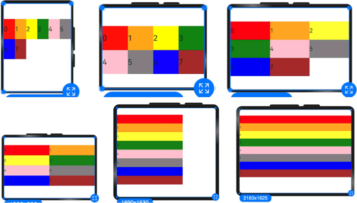
图 1 栅格容器布局显示效果
Columns 的默认值为 12,即在未设置 columns 时,任何断点下,栅格布局被分成 12 列,示例代码如下:
图 2 设置布局总列数后的显示效果
当 columns 为自定义值时,栅格布局在任何尺寸设备下都被分为 columns 列。在下面的实例中,分别设置栅格布局列数为 4 和 8,子元素默认占一列。
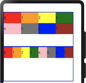
图 3 不同列数的显示效果对比
当 columns 类型为 GridRowColumnOption 时,支持 6 种不同尺寸(xs, sm, md, lg, xl, xxl)设备的总列数设置,各个尺寸下的数值可不同,示例代码如下:
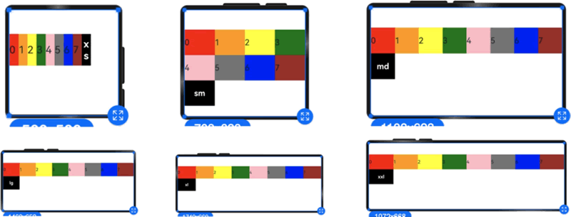
图 4 相同列数在不同尺寸下的显示效果
若只设置 sm 和 md 的栅格总列数,则较小的尺寸使用默认 columns 值(即 12),较大的尺寸使用前一个尺寸的 columns 值。这里只设置 sm:4 和 md:8,则较小尺寸的是 xs:12,较大尺寸的参照 md 的设置,为 lg:8, xl:8, xxl:8。
子组件默认从左往右排列,示例代码如下:
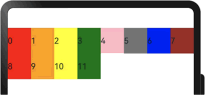
图 5 默认子组件排列方向显示效果
子组件从右往左排列的示例代码如下:
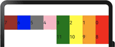
图 6 子组件从右向左排列的显示效果
例如,在下面的实例中,设置子组件在水平与垂直方向上与相邻元素的间距为 10:
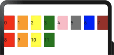
图 7 同时设置子组件间水平和垂直方向间距的显示效果
当 gutter 的类型为 GutterOption 时,可以单独设置栅格子组件的水平和垂直间距。此时,x 属性用于设置水平方向的间距,y 属性用于设置垂直方向的间距。示例代码如下:
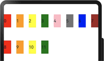
图 8 单独设置子组件间水平和垂直方向间距的显示效果
设置 span 的示例代码如下:
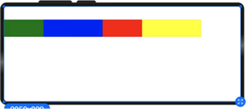
图 9 设置Span之后的显示效果
设置 offset 的示例代码如下:
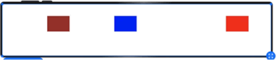
图 10 设置offset之后的显示效果
设置 order 的示例代码如下:
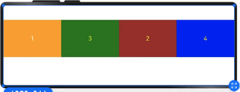
图 11 设置order之后的显示效果
示例代码如下:
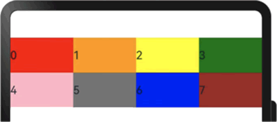
图 12 设置span之后的显示效果
当 span 类型为 GridColColumnOption 时,支持在 6 种不同尺寸(xs, sm, md, lg, xl, xxl)设备中设置子组件所占列数,并且各个尺寸下列数值可不同。示例代码如下:
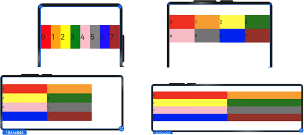
图 13 不同尺寸下的显示效果
示例代码如下:
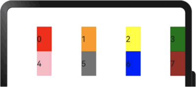
图 14 设置offset之后的显示效果
栅格默认分成 12 列,每一个子组件默认占 1 列,当偏移 2 列时,每个子组件及间距共占 3 列,因此一行放 4 个子组件。
当 offset 的类型为 GridColColumnOption 时,支持在 6 种不同尺寸(xs, sm, md, lg, xl, xxl)设备中设置子组件所占列数,并且各个尺寸下列数值可不同,示例代码如下:
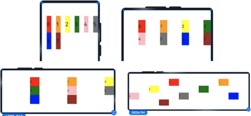
图 15 子组件在不同断点处的偏移量
order 设置的示例代码如下:
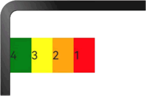
图 16 设置order之后的显示效果
当 order 类型为 GridColColumnOption 时,支持 6 种不同尺寸(xs, sm, md, lg, xl, xxl)设备中设置子组件排序次序。
例如,在 xs 设备中,子组件排列顺序为 1234;在 sm 设备中为 2341;在 md 子组件中排列顺序为 3412;在 lg 子组件中排列顺序为 2431,示例代码如下:
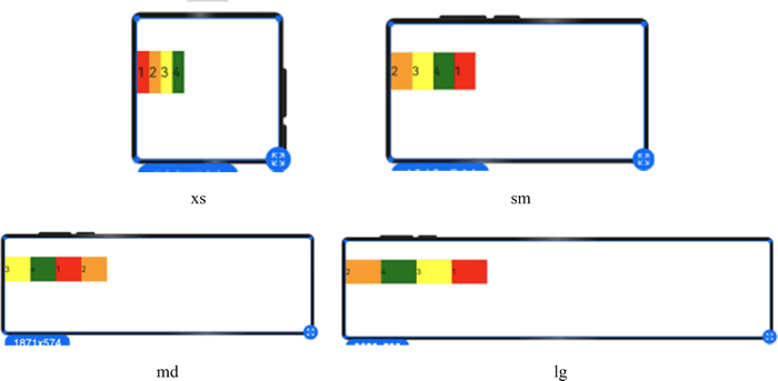
图 17 不同尺寸设备下不同order的显示效果
在下面实例中,栅格把整个空间分为 12 份;
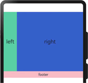
图 18 栅格组件的嵌套使用
综上所述,栅格组件提供了丰富的自定义能力,功能异常灵活和强大。只需明确栅格在不同断点下的 columns、margin、gutter 及 span 等参数,即可确定最终布局,而无须关心具体的设备类型及设备状态(如横竖屏)等。
- 提供可循的规律:栅格布局可以提供规律性的结构,解决了多尺寸多设备的动态布局问题。通过将页面划分为等宽的列和行,可以方便地对页面元素进行定位和排版;
- 统一的定位标注:栅格布局可以为系统提供统一的定位标注,保证不同设备上各个模块的布局一致性,从而减少设计和开发的复杂度,提高工作效率;
- 灵活的间距调整方法:栅格布局可以提供一种灵活的间距调整方法,满足特殊场景布局调整的需求。通过调整列与列和行与行的间距,可以控制整个页面的排版效果;
- 自动换行和自适应:栅格布局可以完成一对多布局的自动换行和自适应。当页面元素的数量超出了一行或一列的容量时,它们会自动换到下一行或下一列,并且在不同的设备上自适应排版,使得页面布局更加灵活,有更强的适应性。
GridRow 为栅格容器组件,需要与栅格子组件 GridCol 在栅格布局场景中联合使用。
栅格容器GridRow
栅格系统以设备的水平宽度(屏幕密度像素值,单位为 vp)作为断点依据,定义设备的宽度类型,形成了一套断点规则。开发者可根据需求在不同的断点区间实现不同的页面布局效果。栅格系统默认断点将设备宽度分为 xs、sm、md、lg 四类,如下表所示。
| 断点名称 | 取值范围(vp) | 设备描述 |
|---|---|---|
| xs | [0, 320] | 最小宽度类型设备 |
| sm | [320, 520] | 小宽度类型设备 |
| md | [520, 840] | 中等宽度类型设备 |
| lg | [840, +∞) | 大宽度类型设备 |
在 GridRow 栅格组件中,允许开发者使用 breakpoints 自定义断点的取值范围,最多支持 6 个断点,除了默认的 4 个断点外,还可以启用 xl、xxl 两个断点,总共支持 6 种不同尺寸(xs, sm, md, lg, xl, xxl)设备的布局设置,如下表所示。
| 断点名称 | 设备描述 |
|---|---|
| xs | 最小宽度类型设备 |
| sm | 小宽度类型设备 |
| md | 中等宽度类型设备 |
| lg | 大宽度类型设备 |
| xl | 特大宽度类型设备 |
| xxl | 超大宽度类型设备 |
针对断点位置,开发者可以根据实际使用场景,通过一个单调递增数组来进行设置。由于 breakpoints 最多支持 6 个断点,因此单调递增数组的最大长度为 5。例如:
breakpoints: {value: ['100vp', '200vp']}
表示启用 xs、sm、md 共 3 个断点,小于 100vp 的为 xs,100~200vp 的为 sm,大于 200vp 的为 md。又如:
breakpoints: {value: ['320vp', '520vp', '840vp', '1080vp']}
表示启用 xs、sm、md、lg、xl 共 5 个断点,小于 320vp 的为 xs,320~520vp 的为 sm,520~840vp 的为 md,840~1080vp 的为 lg,大于 1080vp 的为 xl。栅格系统通过监听窗口或容器的尺寸变化进行断点,通过 reference 设置断点切换参考物。考虑到应用可能以非全屏窗口的形式显示,因此以应用窗口宽度为参照物更为通用。
例如,使用栅格的默认列数(12 列),通过断点设置将应用宽度分成 6 个区间,在各区间中,每个栅格子元素占用的列数均不同,示例代码如下:
@Entry
@Component
struct GridLayoutDemo {
  @State bgColors: Color[] = [
    Color.Red, Color.Orange, Color.Yellow, Color.Green,
    Color.Pink, Color.Grey, Color.Blue, Color.Brown
  ];

  build() {
    GridRow({
      breakpoints: {
        value: ['200vp', '300vp', '400vp', '500vp', '600vp'],
        reference: BreakpointsReference.WindowSize
      }
    }) {
      ForEach(this.bgColors, (color: Color, index?: number) => {
        GridCol({
          span: {
            xs: 2, // 在最小宽度类型设备上,栅格子组件占据栅格容器 2 列
            sm: 3, // 在小宽度类型设备上,栅格子组件占据栅格容器 3 列
            md: 4, // 在中等宽度类型设备上,栅格子组件占据栅格容器 4 列
            lg: 6, // 在大宽度类型设备上,栅格子组件占据栅格容器 6 列
            xl: 8, // 在特大宽度类型设备上,栅格子组件占据栅格容器 8 列
            xxl: 12 // 在超大宽度类型设备上,栅格子组件占据栅格容器 12 列
          }
        }) {
          Row() {
            Text(`${index}`)
          }
          .width('100%')
          .height('50vp')
        } .backgroundColor(color)
      })
    }
  }
}
显示效果如下图所示:图 1 栅格容器布局显示效果
布局的总列数
在 GridRow 中,通过 columns 设置栅格布局的总列数。Columns 的默认值为 12,即在未设置 columns 时,任何断点下,栅格布局被分成 12 列,示例代码如下:
@Entry
@Component
struct GridSample {
  @State bgColors: Color[] = [
    Color.Red, Color.Orange, Color.Yellow,
    Color.Green, Color.Pink, Color.Grey,
    Color.Blue, Color.Brown, Color.Red,
    Color.Orange, Color.Yellow, Color.Green
  ];

  build() {
    // 栅格行组件
    GridRow() {
      // 通过循环渲染,向栅格行组件中添加栅格列子组件
      ForEach(this.bgColors, (item: Color, index?: number) => {
        GridCol() {
          Row() {
            Text(`${index}`)
          }
          .width('100%')
          .height('50')
          .backgroundColor(item)
        }
      })
    }
    .width('100%')
    .height('100%')
  }
}
显示效果如下图所示:图 2 设置布局总列数后的显示效果
当 columns 为自定义值时,栅格布局在任何尺寸设备下都被分为 columns 列。在下面的实例中,分别设置栅格布局列数为 4 和 8,子元素默认占一列。
import { promptAction } from '@kit.ArkUI';
import { BusinessError } from '@kit.BasicServicesKit';

// 使用 Record 类型数据设置边框样式
let BorderWH: Record<string, Color | number> = { 'color': Color.Blue, 'width': 2 };

@Entry
@Component
struct GridSample {
  @State bgColors: Color[] = [
    Color.Red, Color.Orange, Color.Yellow,
    Color.Green, Color.Pink, Color.Grey,
    Color.Blue, Color.Brown
  ];

  build() {
    Column() {
      Row() {
        // 栅格行组件,设置一行显示 4 列
        GridRow({ columns: 4 }) {
          ForEach(this.bgColors, (item: Color, index?: number | underfined) => {
            GridCol() {
              Row() {
                Text(`${index}`)
              }
              .width('100%')
              .height('50')
            }
            .backgroundColor(item)
          })
        }
        .width('100%')
        .height('100%')
      }
      .height(160)
      .border(BorderWH)
      .width('90%')

      Row() {
        // 栅格行组件,设置一行显示 8 列
        GridRow({ columns: 8 }) {
          ForEach(this.bgColors, (item: Color, index?: number | undefined) => {
            GridCol() {
              Row() {
                Text(`${index}`)
              }
              .width('100%')
              .height('50')
            }
            .backgroundColor(item)
          })
        }
        .width('100%')
        .height('100%')
      }
      .height(160)
      .border(BorderWH)
      .width('90%')
    }
  }
}
显示效果如下图所示:图 3 不同列数的显示效果对比
当 columns 类型为 GridRowColumnOption 时,支持 6 种不同尺寸(xs, sm, md, lg, xl, xxl)设备的总列数设置,各个尺寸下的数值可不同,示例代码如下:
import { promptAction } from '@kit.ArkUI';
import { BusinessError } from '@kit.BasicServicesKit';

@Entry
@Component
struct GridSample {
  @State bgColors: Color[] = [
    Color.Red, Color.Orange, Color.Yellow,
    Color.Green, Color.Pink, Color.Grey,
    Color.Blue, Color.Brown
  ];

  @State currentBreakpoint: string = 'unknown';

  build() {
    GridRow({
      // 如果断点是 sm,每行显示 4 列;如果断点是 md,每行显示 8 列
      columns: { sm: 4, md: 8 },
      // 断点定义,5 个数字定义 6 个断点:xs, sm, md, lg, xl, xxl
      breakpoints: { value: ['200vp', '300vp', '400vp', '500vp', '600vp'] }
    }) {
      ForEach(this.bgColors, (item: Color, index?: number) => {
        GridCol() {
          Row() {
            Text(`${index}`)
          }
          .width('100%')
          .height('50')
          .backgroundColor(item)
        }
      })

      GridCol() {
        Row() {
          Text(this.currentBreakpoint)
            .fontColor(Color.White)
            .fontWeight(FontWeight.Bold)
            .backgroundColor(Color.Black)
            .width('100%')
            .height('100%')
            .textAlign(TextAlign.Center)
        }
        .width('100%')
        .height('50')
      }
      .onBreakpointChange((breakpoint: string) => {
        this.currentBreakpoint = breakpoint;
      })
    }
  }
}
显示效果如下图所示:图 4 相同列数在不同尺寸下的显示效果
若只设置 sm 和 md 的栅格总列数,则较小的尺寸使用默认 columns 值(即 12),较大的尺寸使用前一个尺寸的 columns 值。这里只设置 sm:4 和 md:8,则较小尺寸的是 xs:12,较大尺寸的参照 md 的设置,为 lg:8, xl:8, xxl:8。
GridRow排列方向
栅格布局中,可以通过设置 GridRow 的 direction 属性来指定栅格子组件在栅格容器中的排列方向。该属性可以设置为 GridRowDirection.Row(从左往右排列)或 GridRowDirection.RowReverse(从右往左排列),以满足不同的布局需求。通过合理的 direction 属性设置,可以使得页面布局更加灵活和符合设计要求。子组件默认从左往右排列,示例代码如下:
@Entry
@Component
struct GridSample {
  @State bgColors: Color[] = [
    Color.Red, Color.Orange, Color.Yellow,
    Color.Green, Color.Pink, Color.Grey,
    Color.Blue, Color.Brown, Color.Red,
    Color.Orange, Color.Yellow, Color.Green
  ];

  build() {
    // 子组件从左往右排列(默认值)
    GridRow({ direction: GridRowDirection.Row, columns: 8 }) {
      ForEach(this.bgColors, (item: Color, index?: number) => {
        GridCol() {
          Row() {
            Text(`${index}`)
          }
          .width('100%')
          .height('50')
        }
        .backgroundColor(item)
      })
    }
    .width('100%')
    .height('100%')
  }
}
显示效果如下图所示:图 5 默认子组件排列方向显示效果
子组件从右往左排列的示例代码如下:
@Entry
@Component
struct GridSample {
  @State bgColors: Color[] = [
    Color.Red, Color.Orange, Color.Yellow,
    Color.Green, Color.Pink, Color.Grey,
    Color.Blue, Color.Brown, Color.Red,
    Color.Orange, Color.Yellow, Color.Green
  ];

  build() {
    // 子组件从右往左排列
    GridRow({ direction: GridRowDirection.RowReverse, columns: 8 }) {
      ForEach(this.bgColors, (item: Color, index?: number) => {
        GridCol() {
          Row() {
            Text(`${index}`)
          }
          .width('100%')
          .height('50')
        }
        .backgroundColor(item)
      })
    }
    .width('100%')
    .height('100%')
  }
}
显示效果如下图所示:图 6 子组件从右向左排列的显示效果
GridRow子组件间距
在 GridRow 中,可以通过 gutter 属性来设置子元素在水平和垂直方向的间距。当 gutter 的类型为 number 时,栅格子组件的水平和垂直方向的间距将被统一设置,且两者的间距值相等。例如,在下面的实例中,设置子组件在水平与垂直方向上与相邻元素的间距为 10:
@Entry
@Component
struct GridSample {
  @State bgColors: Color[] = [
    Color.Red, Color.Orange, Color.Yellow,
    Color.Green, Color.Pink, Color.Grey,
    Color.Blue, Color.Brown, Color.Red,
    Color.Orange, Color.Yellow, Color.Green
  ];

  build() {
    // gutter 设置子组件在水平与垂直方向上与相邻元素的间距为 10 vp
    GridRow({ gutter: 10, columns: 8 }) {
      ForEach(this.bgColors, (item: Color, index?: number) => {
        GridCol() {
          Row() {
            Text(`${index}`)
          }
          .width('100%')
          .height('50')
        }
        .backgroundColor(item)
      })
    }
    .width('100%')
    .height('100%')
  }
}
显示效果如下图所示:图 7 同时设置子组件间水平和垂直方向间距的显示效果
当 gutter 的类型为 GutterOption 时,可以单独设置栅格子组件的水平和垂直间距。此时,x 属性用于设置水平方向的间距,y 属性用于设置垂直方向的间距。示例代码如下:
@Entry
@Component
struct GridSample {
  @State bgColors: Color[] = [
    Color.Red, Color.Orange, Color.Yellow,
    Color.Green, Color.Pink, Color.Grey,
    Color.Blue, Color.Brown, Color.Red,
    Color.Orange, Color.Yellow, Color.Green
  ];

  build() {
    // gutter 设置子组件水平方向的间距为 20 vp,垂直方向的间距为 50 vp
    GridRow({ gutter: { x: 20, y: 50 }, columns: 8 }) {
      ForEach(this.bgColors, (item: Color, index?: number) => {
        GridCol() {
          Row() {
            Text(`${index}`)
          }
          .width('100%')
          .height('50')
        }
        .backgroundColor(item)
      })
    }
    .width('100%')
    .height('100%')
  }
}
显示效果如下图所示:图 8 单独设置子组件间水平和垂直方向间距的显示效果
子组件GridCol
GridCol 是 GridRow 组件的子组件,可以通过给 GridCol 传参或者设置属性这两种方式,设置 span(占用列数)、offset(偏移列数)和 order(元素序号)的值。设置 span 的示例代码如下:
// 以 Record 类型数据的方式设置布局参数
// 当断点是 xs 时组件占据 1 个单元格,当断点是 sm 时组件占据 2 个单元格
// 当断点是 md 时组件占据 3 个单元格,当断点是 lg 时组件占据 4 个单元格
let Gspan: Record<string, number> = {
  xs: 1, sm: 2, md: 3, lg: 4
};

@Entry
@Component
struct GridSample {
  build() {
    Column() {
      GridRow() {
        // 组件占据 2 个单元格
        GridCol({ span: 2 })
          .backgroundColor(Color.Green)
          .height(50)

        // 当断点是 xs/sm/md/lg 时分别占据 1/2/3/4 个单元格
        GridCol({ span: { xs: 1, sm: 2, md: 3, lg: 4 } })
          .backgroundColor(Color.Blue)
          .height(50)

        // 通过属性的方式设置组件占据 2 个单元格
        GridCol()
          .span(2)
          .backgroundColor(Color.Red)
          .height(50)

        // 通过 Record 形式,在不同断点下占据不同单元格
        GridCol()
          .span(Gspan)
          .backgroundColor(Color.Yellow)
          .height(50)
      }
    }
  }
}
显示效果如下图所示:图 9 设置Span之后的显示效果
设置 offset 的示例代码如下:
// 以 Record 类型数据的形式设置布局参数
// 当断点是 xs 时偏移量为 1 个单元格,当断点是 sm 时偏移量为 2 个单元格
// 当断点是 md 时偏移量为 3 个单元格,当断点是 lg 时偏移量为 4 个单元格
let Goffset: Record<string, number> = {
  xs: 1, sm: 2, md: 3, lg: 4
};

@Entry
@Component
struct GridSample {
  build() {
    GridRow() {
      // 设置单元格偏移量为 2 个单元格
      GridCol({ offset: 2 })
        .backgroundColor(Color.Brown)
        .height(50)

      // 当断点是 xs / sm / md / lg 时偏移量均为 2 个单元格
      GridCol({ offset: { xs: 2, sm: 2, md: 2, lg: 2 } })
        .backgroundColor(Color.Blue)
        .height(50)

      // 通过 Record 类型数据设置属性,在不同断点下使用不同偏移量
      GridCol()
        .offset(Goffset)
        .backgroundColor(Color.Red)
        .height(50)
    }
    .height('100%')
    .width('100%')
  }
}
显示效果如下图所示:图 10 设置offset之后的显示效果
设置 order 的示例代码如下:
// 以 Record 类型数据的方式设置布局参数
// 当断点是 xs 时次序为 1,当断点是 sm 时次序为 2,
// 当断点是 md 时次序为 3,当断点是 lg 时次序为 4
let Gorder: Record<string, number> = {
  xs: 1, sm: 2, md: 3, lg: 4
};

@Entry
@Component
struct GridSample {
  build() {
    GridRow({ columns: 4 }) {
      // 设置排列次序为 2
      GridCol({ order: 2 }) {
        Text('1')
          .height('100%')
          .width('100%')
          .textAlign(TextAlign.Center)
          .fontColor(Color.White)
      }
      .backgroundColor(Color.Orange)

      // 断点:xs→1, sm→2, md→3, lg→4
      GridCol({ order: { xs: 1, sm: 2, md: 3, lg: 4 } }) {
        Text('2')
          .fontColor(Color.Yellow)
          .height('100%')
          .width('100%')
          .textAlign(TextAlign.Center)
      }
      .backgroundColor(Color.Brown)

      // 以属性的方式设置次序为 2
      GridCol() {
        Text('3')
          .fontColor(Color.Yellow)
          .height('100%')
          .width('100%')
          .textAlign(TextAlign.Center)
      }
      .backgroundColor(Color.Green)
      .order(2)

      // 以属性的方式设置不同断点下的次序
      GridCol() {
        Text('4')
          .fontColor(Color.Yellow)
          .height('100%')
          .width('100%')
          .textAlign(TextAlign.Center)
      }
      .backgroundColor(Color.Blue)
      .order(Gorder)
    }
    .height(100)
  }
}
显示效果如下图所示:图 11 设置order之后的显示效果
GridCol span
span 是子组件占栅格布局的列数,决定了子组件的宽度,其默认值为 1。当其类型为 number 时,子组件在所有尺寸设备下占用的列数相同。示例代码如下:
@Entry
@Component
struct GridSample {
  @State bgColors: Color[] = [
    Color.Red, Color.Orange, Color.Yellow,
    Color.Green, Color.Pink, Color.Grey,
    Color.Blue, Color.Brown
  ];

  build() {
    // 设置每行分配 8 个单元格
    GridRow({ columns: 8 }) {
      ForEach(this.bgColors, (color: Color, index?: number) => {
        // 设置子组件占据的单元格个数为 2
        GridCol({ span: 2 }) {
          Row() {
            Text(`${index}`)
          }
          .width('100%')
          .height('50vp')
          .backgroundColor(color)
        }
      })
    }
  }
}
显示效果如下图所示:图 12 设置span之后的显示效果
当 span 类型为 GridColColumnOption 时,支持在 6 种不同尺寸(xs, sm, md, lg, xl, xxl)设备中设置子组件所占列数,并且各个尺寸下列数值可不同。示例代码如下:
@Entry
@Component
struct GridSample {
  @State bgColors: Color[] = [
    Color.Red, Color.Orange, Color.Yellow,
    Color.Green, Color.Pink, Color.Grey,
    Color.Blue, Color.Brown
  ];

  build() {
    // 设置每行分配 8 个单元格
    GridRow({ columns: 8 }) {
      ForEach(this.bgColors, (color: Color, index?: number) => {
        // 设置子组件占据的单元格数量:
        // 当断点为 xs 时占据 1 个单元格,
        // 当断点为 sm 时占据 2 个单元格,
        // 当断点为 md 时占据 3 个单元格,
        // 当断点为 lg 时占据 4 个单元格
        GridCol({ span: { xs: 1, sm: 2, md: 3, lg: 4 } }) {
          Row() {
            Text(`${index}`)
          }
          .width('100%')
          .height('50vp')
        }  .backgroundColor(color)
      })
    }
  }
}
显示效果如下图所示:图 13 不同尺寸下的显示效果
GridCol offset
offset 表示栅格子组件相对于前一个子组件的偏移列数,默认值为 0。当 offset 类型为 number 时,所有子组件偏移相同列数。示例代码如下:
@Entry
@Component
struct GridSample {
  @State bgColors: Color[] = [
    Color.Red, Color.Orange, Color.Yellow,
    Color.Green, Color.Pink, Color.Grey,
    Color.Blue, Color.Brown
  ];

  build() {
    GridRow() {
      ForEach(this.bgColors, (color: Color, index?: number) => {
        // 设置子组件偏移量为 2 个单元格
        GridCol({ offset: 2 }) {
          Row() {
            Text(`${index}`)
          }
          .width('100%')
          .height('50vp')
        }  .backgroundColor(color)
      })
    }
  }
}
显示效果如下图所示:图 14 设置offset之后的显示效果
栅格默认分成 12 列,每一个子组件默认占 1 列,当偏移 2 列时,每个子组件及间距共占 3 列,因此一行放 4 个子组件。
当 offset 的类型为 GridColColumnOption 时,支持在 6 种不同尺寸(xs, sm, md, lg, xl, xxl)设备中设置子组件所占列数,并且各个尺寸下列数值可不同,示例代码如下:
@Entry
@Component
struct GridSample {
  @State bgColors: Color[] = [
    Color.Red, Color.Orange, Color.Yellow,
    Color.Green, Color.Pink, Color.Grey,
    Color.Blue, Color.Brown
  ];

  build() {
    GridRow() {
      ForEach(this.bgColors, (color: Color, index?: number) => {
        // 设置子组件在不同断点时的偏移量:
        // xs 偏移 1 个单元格,sm 偏移 2 个单元格,
        // md 偏移 3 个单元格,lg 偏移 4 个单元格
        GridCol({ offset: { xs: 1, sm: 2, md: 3, lg: 4 } }) {
          Row() {
            Text('' + index)
          }
          .width('100%')
          .height('50vp')
        } .backgroundColor(color)
      })
    }
  }
}
显示效果如下图所示:图 15 子组件在不同断点处的偏移量
GridCol order
order 表示栅格子组件的序号,决定了子组件的排列次序:- 当子组件不设置 order 或者设置相同的 order 时,子组件按照代码顺序展示;
- 当子组件设置不同的 order 时,order 较小的组件在前,较大的在后;
- 当子组件部分设置 order,部分不设置 order 时,未设置 order 的子组件依次排序靠前,设置了 order 的子组件按照数值从小到大排列;
- 当 order 类型为 number 时,子组件在任何尺寸下排序次序一致。
order 设置的示例代码如下:
@Entry
@Component
struct GridSample {
  build() {
    GridRow() {
      // 设置次序为 4
      GridCol({ order: 4 }) {
        Row() {
          Text('1')
        }
        .width('100%')
        .height('50vp')
      }  .backgroundColor(Color.Red)

      // 设置次序为 3
      GridCol({ order: 3 }) {
        Row() {
          Text('2')
        }
        .width('100%')
        .height('50vp')
      } .backgroundColor(Color.Orange)

      // 设置次序为 2
      GridCol({ order: 2 }) {
        Row() {
          Text('3')
        }
        .width('100%')
        .height('50vp')
      }  .backgroundColor(Color.Yellow)

      // 设置次序为 1
      GridCol({ order: 1 }) {
        Row() {
          Text('4')
        }
        .width('100%')
        .height('50vp')
      }  .backgroundColor(Color.Green)
    }
  }
}
显示效果如下图所示:图 16 设置order之后的显示效果
当 order 类型为 GridColColumnOption 时,支持 6 种不同尺寸(xs, sm, md, lg, xl, xxl)设备中设置子组件排序次序。
例如,在 xs 设备中,子组件排列顺序为 1234;在 sm 设备中为 2341;在 md 子组件中排列顺序为 3412;在 lg 子组件中排列顺序为 2431,示例代码如下:
@Entry
@Component
struct GridSample {
  build() {
    GridRow() {
      // 当处于断点 xs 时次序为 1,当处于断点 sm 时次序为 5,
      // 当处于断点 md 时次序为 3,当处于断点 lg 时次序为 7
      GridCol({ order: { xs: 1, sm: 5, md: 3, lg: 7 } }) {
        Row() {
          Text('1')
        }
        .width('100%')
        .height('50vp')
      }  .backgroundColor(Color.Red)

      // xs:2, sm:2, md:6, lg:1
      GridCol({ order: { xs: 2, sm: 2, md: 6, lg: 1 } }) {
        Row() {
          Text('2')
        }
        .width('100%')
        .height('50vp')
      }  .backgroundColor(Color.Orange)

      // xs:3, sm:3, md:1, lg:6
      GridCol({ order: { xs: 3, sm: 3, md: 1, lg: 6 } }) {
        Row() {
          Text('3')
        }
        .width('100%')
        .height('50vp')
      }  .backgroundColor(Color.Yellow)

      // xs:4, sm:4, md:2, lg:5
      GridCol({ order: { xs: 4, sm: 4, md: 2, lg: 5 } }) {
        Row() {
          Text('4')
        }
        .width('100%')
        .height('50vp')
      }  .backgroundColor(Color.Green)
    }
  }
}
显示效果如下图所示:图 17 不同尺寸设备下不同order的显示效果
栅格组件的嵌套使用
栅格组件也可以嵌套使用,完成一些复杂的布局。在下面实例中,栅格把整个空间分为 12 份;
- 第一层 GridRow 嵌套 GridCol,分为中间大区域以及 footer 区域;
- 第二层 GridRow 嵌套 GridCol,分为 left 和 right 区域;
- 子组件的空间按照上一层父组件的空间划分。
@Entry
@Component
struct GridRowExample {
  build() {
    GridRow() {
      // 这是一个容器组件,用于创建一个栅格行
      GridCol({ span: { sm: 12 } }) {
        // 在小屏幕设备上(sm)该列将占用 12 个单元格(意味着整行的宽度)
        GridRow() {
          // 第一个子列占用 2 个单元格
          GridCol({ span: { sm: 2 } }) {
            Row() {
              Text('left').fontSize(24)
            }
            .justifyContent(FlexAlign.Center)
            .height('90%')
          }
          .backgroundColor('#ff41dbaa')

          // 第二个子列占用 10 个单元格
          GridCol({ span: { sm: 10 } }) {
            Row() {
              Text('right').fontSize(24)
            }
            .justifyContent(FlexAlign.Center)
            .height('90%')
          }
          .backgroundColor('#ff4168db')
        }
        .backgroundColor('#19000000')
      }

      // 第二个栅格列占用 12 个单元格,容纳一个显示“footer”的文本
      GridCol({ span: { sm: 12 } }) {
        Row() {
          Text('footer')
            .width('100%')
            .textAlign(TextAlign.Center)
        }
        .width('100%')
        .height('10%')
        .backgroundColor(Color.Pink)
      }
    }
    .width('100%')
    .height(300)
  }
}
显示效果如下图所示:图 18 栅格组件的嵌套使用
综上所述,栅格组件提供了丰富的自定义能力,功能异常灵活和强大。只需明确栅格在不同断点下的 columns、margin、gutter 及 span 等参数,即可确定最终布局,而无须关心具体的设备类型及设备状态(如横竖屏)等。
 ICP备案:
 公安联网备案: