Python绘制关系图的多种方法(附带实例)
关系图也称为网络图或节点链接图,是一种用于可视化节点之间关系的图表类型。它通过使用节点和连接线表示数据中的实体和它们之间的关系,以帮助用户观察和分析复杂的网络结构。
关系图的优点是能够直观地显示节点之间的连接关系和结构。它可以帮助观察数据的网络、集群或关联模式,并揭示数据中隐藏的关系和趋势。
【实例 1】利用 igraph 包绘制关系图示例。输入如下代码:
【实例 2】使用 Bokeh 绘制一个图形交互演示,展示一个社交网络图。输入如下代码:
关系图的优点是能够直观地显示节点之间的连接关系和结构。它可以帮助观察数据的网络、集群或关联模式,并揭示数据中隐藏的关系和趋势。
【实例 1】利用 igraph 包绘制关系图示例。输入如下代码:
import plotly.graph_objects as go
import networkx as nx

# 创建一个具有200个节点和连接概率为0.125的随机几何图形图
G = nx.random_geometric_graph(200, 0.125)

# 初始化边的坐标列表
edge_x = []
edge_y = []
# 遍历图中的每条边,提取节点坐标信息
for edge in G.edges():
    x0, y0 = G.nodes[edge[0]]['pos']
    x1, y1 = G.nodes[edge[1]]['pos']
    # 添加边的起点和终点的坐标到对应的列表中,并使用None分隔每条边
    edge_x.extend([x0, x1, None])
    edge_y.extend([y0, y1, None])

# 创建边的散点图
edge_trace = go.Scatter(
    x=edge_x,
    y=edge_y,
    line=dict(width=0.5, color='#888'),
    # 设置边的样式
    hoverinfo='none',
    mode='lines'
)

# 初始化节点的坐标列表
node_x = []
node_y = []
# 遍历图中的每个节点,提取节点坐标信息
for node in G.nodes():
    x, y = G.nodes[node]['pos']
    # 添加节点的坐标到对应的列表中
    node_x.append(x)
    node_y.append(y)

# 创建节点的散点图
node_trace = go.Scatter(
    x=node_x,
    y=node_y,
    mode='markers',
    hoverinfo='text',
    # 设置节点的颜色和大小
    marker=dict(
        showscale=True,
        colorscale='YlGnBu',
        # 颜色映射
        reversescale=True,
        color=[],
        # 存储节点的连接数
        size=10,
        colorbar=dict(
            thickness=15,
            title='Node Connections',
            xanchor='left',
            titleside='right'
        ),
        line_width=2
    )
)

# 存储每个节点的邻接节点数和文本信息
node_adjacencies = []
node_text = []
for node, adjacencies in enumerate(G.adjacency()):
    node_adjacencies.append(len(adjacencies[1]))
    node_text.append('# of connections: ' + str(len(adjacencies[1])))

# 将节点的邻接节点数赋予节点的颜色属性,将文本信息赋予节点的悬停文本属性
node_trace.marker.color = node_adjacencies
node_trace.text = node_text

# 创建图形对象
fig = go.Figure(
    data=[edge_trace, node_trace],
    layout=go.Layout(
        title='<br>Network graph made with Python',
        # 设置图的标题
        titlefont_size=16,
        showlegend=False,
        hovermode='closest',
        margin=dict(b=20, l=5, r=5, t=40),
        # 添加注释
        annotations=[
            dict(
                text="Python code",
                showarrow=False,
                xref="paper",
                yref="paper",
                x=0.005,
                y=-0.002
            )
        ],
        xaxis=dict(showgrid=False, zeroline=False, showticklabels=False),
        yaxis=dict(showgrid=False, zeroline=False, showticklabels=False)
    )
)

fig.show()
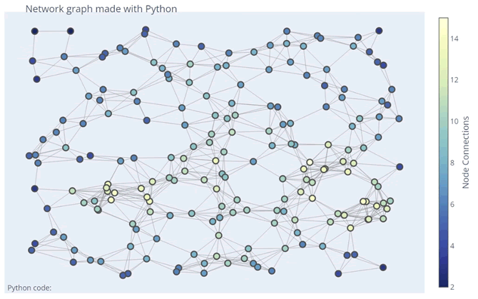
上述代码使用 NetworkX 和 Plotly 库创建了一个具有 200 个节点和连接概率为 0.125 的随机几何图形图,并绘制了节点和边的散点图。节点的颜色根据其邻接节点数进行了编码,节点的大小表示其在图中的重要性。输出的结果如下图所示:【实例 2】使用 Bokeh 绘制一个图形交互演示,展示一个社交网络图。输入如下代码:
import networkx as nx
from bokeh.models import MultiLine, Scatter
from bokeh.plotting import figure, from_networkx, show

G = nx.karate_club_graph()
# 创建一个 Karate club 图
# 定义同一俱乐部和不同俱乐部的边颜色
SAME_CLUB_COLOR, DIFFERENT_CLUB_COLOR = "darkgrey", "red"
edge_attrs = {}
# 遍历每条边,设置边的颜色属性
for start_node, end_node, _ in G.edges(data=True):
    edge_color = SAME_CLUB_COLOR if G.nodes[start_node]["club"] == G.nodes[end_node]["club"] else DIFFERENT_CLUB_COLOR
    edge_attrs[(start_node, end_node)] = edge_color
# 设置边的颜色属性
nx.set_edge_attributes(G, edge_attrs, "edge_color")
# 创建 Bokeh 图表对象,并将背景设置为白色
plot = figure(width=400, height=400, x_range=(-1.2, 1.2), y_range=(-1.2, 1.2),
              x_axis_location=None, y_axis_location=None,
              toolbar_location=None,
              title="Graph Interaction Demo", background_fill_color="white",
              tooltips="index: @index, club: @club")
plot.grid.grid_line_color = None
# 从 NetworkX 图创建图渲染器
graph_renderer = from_networkx(G, nx.spring_layout, scale=1, center=(0, 0))
# 设置节点渲染器
graph_renderer.node_renderer.glyph = Scatter(size=15, fill_color="lightblue")
# 设置边渲染器
graph_renderer.edge_renderer.glyph = MultiLine(line_color="edge_color",line_alpha=1, line_width=2)
# 将图渲染器添加到图表中
plot.renderers.append(graph_renderer)
show(plot)
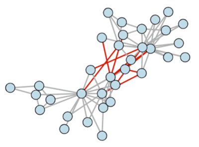
上述代码使用 NetworkX 创建了一个 Karate Club 图,并利用 Bokeh 库将其绘制出来。图中的节点表示俱乐部成员,边表示成员之间的联系。同一俱乐部的成员由灰色边连接,不同俱乐部的成员由红色边连接。当鼠标悬停在节点上时,会显示节点的索引和俱乐部。输出的结果如下图所示: ICP备案:
 公安联网备案: