Matplotlib设置坐标轴刻度标签的多种方法(附带实例)
在 Matplotlib 中,有时创建的图表中的坐标轴刻度不是连续的,比如 x 轴的刻度是 2、4、6、8、10 和 12,y轴也可能是类似的情况。
如果希望 x 轴的刻度按照 1、2、3、4、5 等连续数字的方式显示,则需要更改坐标轴的刻度。使用 pyplot 模块中的 xticks() 函数和 yticks() 函数,或 Axis 对象的 set_ticks() 方法,可以更改坐标轴的刻度。
下面的代码是使用 xticks() 函数和 yticks() 函数分别将 x 轴和 y 轴的刻度细化显示:
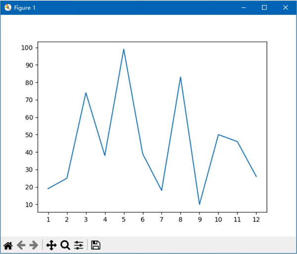
图 1 设置坐标轴的刻度
使用 Axis 对象的 set_ticks() 方法可以实现相同的功能,但是需要先使用 Axes 对象的 xaxis 属性和 yaxis 属性分别引用 x 轴和 y 轴,然后再使用 set_ticks() 方法设置 x 轴和 y 轴的刻度。
无论是 xticks() 函数和 yticks() 函数,还是 set_ticks() 方法,上面的示例都只为它们指定了第一个参数。它们还有一个关键字参数 labels,用于设置刻度的标签,即显示在刻度旁边的数字或文字。
下面的代码将 x 轴的刻度标签设置为 1 月、2 月、3 月……12 月的形式:
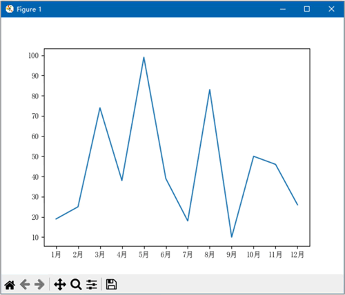
图 2 设置坐标轴的刻度标签
如果想要减少代码的行数,可以使用列表推导式代替 for 循环语句,修改后的代码如下:
如果希望 x 轴的刻度按照 1、2、3、4、5 等连续数字的方式显示,则需要更改坐标轴的刻度。使用 pyplot 模块中的 xticks() 函数和 yticks() 函数,或 Axis 对象的 set_ticks() 方法,可以更改坐标轴的刻度。
下面的代码是使用 xticks() 函数和 yticks() 函数分别将 x 轴和 y 轴的刻度细化显示:
import matplotlib.pyplot as plt
import numpy as np

x = range(1, 13)
np.random.seed(10)
y = np.random.randint(10, 100, 12)
fig, ax = plt.subplots()
ax.plot(x, y)
plt.xticks(x)  # 设置x轴的刻度标签为x的值
plt.yticks(range(10, 101, 10))  # 设置y轴的刻度标签为10到100,步长为10的值
plt.show()
如下图所示:
图 1 设置坐标轴的刻度
使用 Axis 对象的 set_ticks() 方法可以实现相同的功能,但是需要先使用 Axes 对象的 xaxis 属性和 yaxis 属性分别引用 x 轴和 y 轴,然后再使用 set_ticks() 方法设置 x 轴和 y 轴的刻度。
ax.xaxis.set_ticks(x)
ax.yaxis.set_ticks(range(10, 101, 10))
无论是 xticks() 函数和 yticks() 函数,还是 set_ticks() 方法,上面的示例都只为它们指定了第一个参数。它们还有一个关键字参数 labels,用于设置刻度的标签,即显示在刻度旁边的数字或文字。
下面的代码将 x 轴的刻度标签设置为 1 月、2 月、3 月……12 月的形式:
import matplotlib as mpl
import matplotlib.pyplot as plt
import numpy as np

mpl.rcParams['font.sans-serif'] = 'SimSun'  # 设置字体为SimSun,以支持中文显示
x = range(1, 13)
date = []
for d in x:
    date.append(str(d) + '月')
np.random.seed(10)
y = np.random.randint(10, 100, 12)
fig, ax = plt.subplots()
ax.plot(x, y)
ax.xaxis.set_ticks(x, date)  # 设置x轴的刻度标签为日期
ax.yaxis.set_ticks(range(10, 101, 10))  # 设置y轴的刻度标签为10到100,步长为10的值
plt.show()
如下图所示:图 2 设置坐标轴的刻度标签
如果想要减少代码的行数,可以使用列表推导式代替 for 循环语句,修改后的代码如下:
import matplotlib as mpl
import matplotlib.pyplot as plt
import numpy as np

mpl.rcParams['font.sans-serif'] = 'SimSun'  # 设置字体为SimSun以支持中文显示
x = range(1, 13)
date = [str(d) + '月' for d in x]  # 使用列表推导式生成日期标签
np.random.seed(10)  # 设置随机数种子以确保结果可复现
y = np.random.randint(10, 100, 12)  # 生成12个10到100之间的随机整数
fig, ax = plt.subplots()  # 创建图形和轴
ax.plot(x, y)  # 绘制折线图
ax.xaxis.set_ticks(x, date)  # 设置x轴的刻度标签为日期
ax.yaxis.set_ticks(range(10, 101, 10))  # 设置y轴的刻度标签为10到100,步长为10
plt.show()  # 显示图形
 ICP备案:
 公安联网备案: