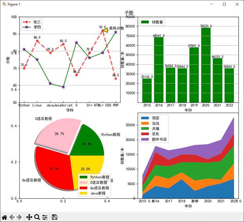
Python subplot()函数:绘制子图
在绘制图表时,往往需要将一张画布划分为若干个子区域,以达到绘制不同图表的目的。
在 Python 中,可以通过 matplotlib.pyplot 模块中的 subplot() 函数绘制子图,其语法格式如下:
示例代码如下:
在 Python 中,可以通过 matplotlib.pyplot 模块中的 subplot() 函数绘制子图,其语法格式如下:
subplot(nrows,ncols,index)
各个参数的含义是:- nrows 表示子区域的行数;
- ncols 表示子区域的列数;
- index 用于指定绘制图表的子区域位置。
示例代码如下:
import matplotlib.pyplot as plt

# 显示中文
plt.rcParams['font.sans-serif'] = 'SimHei'
# 显示负号
plt.rcParams['axes.unicode_minus'] = False
# x轴的刻度线向内显示
plt.rcParams['xtick.direction'] = 'in'
# Y轴的刻度线向外显示
plt.rcParams['ytick.direction'] = 'out'
# 创建画布
plt.figure(figsize=(12, 10))
# 子图标题
plt.title('子图')

def drowsubline():
    """绘制线图"""
    # 数据
    x = [0, 1, 2, 3, 4, 5, 6, 7]
    y1 = [70, 86, 79, 84, 66, 79, 92, 64]
    y2 = [81, 75, 61, 59, 85, 76, 79, 91]
    # 绘制折线图
    plt.plot(x, y1, label='张三', color='red', marker='H', linestyle='--', linewidth=3, alpha=0.6)
    plt.plot(x, y2, label='李四', color='green', marker='*', linestyle='-', linewidth=2, alpha=0.8, mfc='red', ms=8, mec='blue')
    # 创建隐藏y轴的网格线
    plt.grid(axis='y')
    # 设置 x轴标题
    plt.xlabel('学科')
    # 设置y轴标题
    plt.ylabel('分数')
    # 创建 x轴刻度
    plt.xticks(range(0, 8, 1), ['Python', 'Linux', 'Java', 'JavaScript', 'C', 'C++', 'HTML+ CSS', 'PHP'])
    # 创建y轴刻度
    plt.yticks(range(50, 101, 10))
    # 创建文本标签
    for a, b in zip(x, y1):
        plt.text(a, b + 1, '%.1f' % b, ha='center', va='bottom', fontsize=9)
    # 创建注释
    plt.annotate('最高分数', xy=(6, 92), xytext=(6.5, 92.5), xycoords='data', arrowprops=dict(facecolor='yellow', shrink=0.05))
    # 创建图例
    plt.legend(labels=['张三', '李四'], loc=2)

def drowsubbar():
    """绘制柱状图"""
    x = [0, 1, 2, 3, 4, 5, 6, 7]
    y = [25140, 68541, 36584, 35864, 57841, 78520, 46333, 35844]
    # 绘制柱状图
    plt.bar(x, y, color='green', label='销售量')
    # 创建隐藏轴的网格线
    plt.grid(axis='y')
    # 设置 x轴标题
    plt.xlabel('年份')
    # 设置 y轴标题
    plt.ylabel('销售量/本')
    # 创建x轴刻度
    plt.xticks(range(0, 8, 1), ['2015', '2016', '2017', '2018', '2019', '2020', '2021', '2022'])
    # 创建y轴刻度
    plt.yticks(range(10000, 100000, 10000))
    # 创建文本标签
    for a, b in zip(x, y):
        plt.text(a, b + 1, '%.1f' % b, ha='center', va="bottom", fontsize=9)
    # 创建图例
    plt.legend(labels=['销售量'], loc=2)

def drowsubpie():
    """绘制饼图"""
    # 扇面标签
    book = ['Python教程', 'C语言教程', 'Go语言教程', 'Java教程']
    # 扇面数据
    data = [510001, 725458, 854777, 625455]
    # 扇面颜色
    colors = ['green', 'pink', 'red', 'gold']
    # 绘制饼图
    plt.pie(data, labels=book, colors=colors, shadow=True, explode=(0, 0.1, 0, 0), autopct='%.1f%%')
    # 创建图例
    plt.legend(labels=['Python教程', 'C语言教程', 'Go语言教程', 'Java教程'], loc=4)

def drowssubstackplot():
    """绘制面积图"""
    # 数据
    x = [0, 1, 2, 3, 4, 5, 6, 7]
    y = {
        '淘宝': [1234, 4255, 3454, 6522, 2566, 4175, 5125, 6674],
        '当当': [785, 3584, 3254, 2351, 3522, 2541, 1255, 5254],
        '天猫': [2155, 3587, 4233, 3451, 6258, 5444, 6331, 6123],
        '京东': [1200, 4344, 2236, 2666, 2588, 1186, 2631, 4122],
        '新华书店': [2508, 2123, 3211, 2167, 3255, 5123, 4611, 5621]
    }
    # 绘制面积图
    plt.stackplot(x, y.values())
    # 设置x轴标题
    plt.xlabel('年份')
    # 设置y轴标题
    plt.ylabel('销售量/本')
    plt.xticks(range(0, 8, 1), ['2015', '2016', '2017', '2018', '2019', '2020', '2021', '2022'])
    plt.legend(labels=['淘宝', '当当', '天猫', '京东', '新华书店'], loc=2)

# 子图布局
plt.subplot(2, 2, 1)
drowsubline()
plt.subplot(2, 2, 2)
drowsubbar()
plt.subplot(2, 2, 3)
drowsubpie()
plt.subplot(2, 2, 4)
drowssubstackplot()

# 调整子图布局
plt.tight_layout()
# 保存图像
plt.savefig('subplot.png', dpi=72)
plt.show()
上面代码的运行结果如下图所示。