鸿蒙Swiper组件的用法(附带示例)
Swiper 是滑块视图容器,提供子组件滑动轮播显示的能力。
Swiper 的参数是 SwiperController。SwiperController 是 Swiper 容器组件的控制器,可以将对象绑定至 Swiper 组件,可以通过它控制翻页。
SwiperController 具有以下属性:
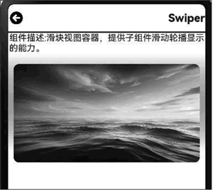
图 1 Swiper组件的示例效果
Swiper 的参数是 SwiperController。SwiperController 是 Swiper 容器组件的控制器,可以将对象绑定至 Swiper 组件,可以通过它控制翻页。
SwiperController 具有以下属性:
- showNext:翻至下一页,带动效切换过程。
- showPrevious:翻至上一页,带动效切换过程。
- finishAnimation:停止播放动画。
Swiper组件的属性
Swiper 组件具有下表中的这些属性:| 属性 | 说明 |
|---|---|
| index | 设置当前在容器中显示的子组件的索引值。 |
| autoPlay | 子组件是否自动播放。 |
| interval | 使用自动播放时播放的时间间隔,单位为毫秒。 |
| indicator | 设置可选导航点指示器样式。 |
| loop | 是否开启循环。 |
| duration | 子组件切换的动画时长,单位为毫秒。 |
| vertical | 是否为纵向滑动。 |
| itemSpace | 设置子组件与子组件的间隙。 |
| displayMode | 主轴方向上元素排列的模式。 |
| cachedCount | 设置预加载子组件个数。 |
| disableSwipe | 禁用组件滑动切换功能。 |
| curve | 设置 Swiper 的动画曲线。 |
| displayCount | 设置 Swiper 视窗内元素显示个数。 |
| effectMode | 边缘滑动效果。 |
| displayArrow | 设置导航点箭头样式。 |
| nextMargin | 后边距,用于露出后一项的一小部分。 |
| prevMargin | 前边距,用于露出前一项的一小部分。 |
| nestedScroll | 设置 Swiper 组件和父组件的嵌套滚动模式。 |
1) Indicator属性的子属性
Indicator 属性还有多个属性值,可以设置导航点与 Swiper 组件的距离:- left:设置导航点与 Swiper 组件左边的距离;
- top:设置导航点与 Swiper 组件顶部的距离;
- right:设置导航点与 Swiper 组件右边的距离;
- bottom:设置导航点与 Swiper 组件底部的距离;
- static dot:返回一个 DotIndicator 对象;
- static digit:返回一个 DigitIndicator 对象。
2) DotIndicator对象
DotIndicator 对象是圆点指示器,其属性及功能继承自 Indicator,可以设置为如下值:- itemWidth:设置 Swiper 组件圆点导航指示器的宽。
- itemHeight:设置 Swiper 组件圆点导航指示器的高。
- selectedItemWidth:设置选中 Swiper 组件圆点导航指示器的宽。
- selectedItemHeight:设置选中 Swiper 组件圆点导航指示器的高。
- mask:设置是否显示Swiper组件圆点导航指示器的蒙版样式。
- color:设置Swiper组件圆点导航指示器的颜色。
- selectedColor:设置选中 Swiper 组件圆点导航指示器的颜色。
3) DigitIndicator
DigitIndicator 对象是数字指示器,其属性及功能继承自 Indicator,可以设置为如下值:- fontColor:设置 Swiper 组件数字导航点的字体颜色;
- selectedFontColor:设置选中 Swiper 组件数字导航点的字体颜色;
- digitFont:设置 Swiper 组件数字导航点的字体样式;
- selectedDigitFont:设置选中 Swiper 组件数字导航点的字体样式。
4) ArrowStyle左右箭头属性
除了可以设置导航点箭头样式 displayArrow 之外,还可设置如下左右箭头的属性:- showBackground:设置箭头底板是否显示;
- isSidebarMiddle:设置箭头显示位置;
- backgroundSize:设置底板大小;
- backgroundColor:设置底板颜色;
- arrowSize:设置箭头大小;
- arrowColor:设置箭头颜色;
- SwiperAutoFill:自适应属性;
- minSize:设置元素显示最小宽度。
Swiper组件的事件
Swiper组件包括以下事件:- onChange:当前显示的子组件索引变化时触发该事件;
- onAnimationStart:切换动画开始时触发该回调;
- onAnimationEnd:切换动画结束时触发该回调;
- onGestureSwipe:在页面跟手滑动过程中,逐帧触发该回调。
Swiper组件的示例
Swiper 组件的示例代码如下:
import { router } from '@kit.ArkUI';
import { Navbar as MyNavbar } from '../components/navBar';
import image from '@ohos.multimedia.image';
import effectKit from '@ohos.effectKit';
import resourceManager from '@ohos.resourceManager';

@Entry
@Component
struct SwiperCom {
  @State desc: string = '';
  @State title: string = '';
  // 获取图片资源
  @State imgData: Resource[] = [
    $r('app.media.image4'),
    $r('app.media.image5'),
    $r('app.media.image6'),
    $r('app.media.image7')
  ];
  // 初始背景色赋值
  @State bgColor: string = "#ffffff";
  // 顶部安全高度赋值
  @State topSafeHeight: number = 0;
  // 创建 swiperController
  private swiperController: SwiperController = new SwiperController();
  // swiper 自动播放时间间隔
  private swiperInterval: number = 3500;
  // swiper 子组件切换动画时长
  private swiperDuration: number = 500;
  // swiper 子组件与子组件的间隙
  private swiperItemSpace: number = 10;

  async aboutToAppear() {
    // 知识点:初始化页面获取第一幅图片的颜色
    const context = getContext(this);
    const resourceMgr: resourceManager.ResourceManager = context.resourceManager;
    const fileData: Uint8Array = await resourceMgr.getMediaContent(this.imgData[0]);
    const buffer = fileData.buffer as ArrayBuffer;
    const imageSource: image.ImageSource = image.createImageSource(buffer);
    const pixelMap: image.PixelMap = await imageSource.createPixelMap();
    // 知识点:使用智能取色器接口,初始化背景色
    effectKit.createColorPicker(pixelMap, (err, colorPicker) => {
      let color = colorPicker.getMainColorSync();
      // 将取色器选取的 color 示例转换为十六进制颜色代码
      this.bgColor = "#" + color.alpha.toString(16) + color.red.toString(16) +
                     color.green.toString(16) + color.blue.toString(16);
    });
  }

  // 加载页面时接收传递过来的参数
  onPageShow(): void {
    // 获取传递过来的参数对象
    const params = router.getParams() as Record<string, string>;
    // 获取传递的值
    if (params) {
      this.desc = params.desc as string;
      this.title = params.value as string;
    }
  }

  build() {
    Column() {
      MyNavbar({ title: this.title });
      Divider().width('100%').strokeWidth(2).color(Color.Black);
      Row() {
        Text(`组件描述:${this.desc}`);
      };

      Column() {
        Swiper(this.swiperController) {
          // 此处为了演示场景,数量只有4个,使用 ForEach。真实场景或列表数量较多的场景,推荐使用
          // LazyForEach + 组件复用 + 缓存列表项实现
          ForEach(this.imgData, (item: Resource) => {
            Image(item)
              .borderRadius(10)
              .margin({ top: 20 });
          });
        }
        .width('100%')
        .height('100%')
        .padding({ left: '10', right: '10' })
        .autoPlay(true)
        .interval(this.swiperInterval)
        .duration(this.swiperDuration)
        .loop(true)
        .itemSpace(this.swiperItemSpace)
        .indicator(false)
        // 切换动画过程获取图片平均色值
        .onAnimationStart(async (index: number, targetIndex: number) => {
          try {
            const context = getContext(this);
            // 获取 resourceManager 资源管理器
            const resourceMgr: resourceManager.ResourceManager = context.resourceManager;
            const fileData: Uint8Array = await resourceMgr.getMediaContent(this.imgData[targetIndex]);
            // 获取图片的 ArrayBuffer
            const buffer = fileData.buffer as ArrayBuffer;
            // 创建 imageSource
            const imageSource: image.ImageSource = image.createImageSource(buffer);
            // 创建 pixelMap
            const pixelMap: image.PixelMap = await imageSource.createPixelMap();
            effectKit.createColorPicker(pixelMap, (err, colorPicker) => {
              // 读取图像主色的颜色值,结果写入 Color
              let color = colorPicker.getMainColorSync();
              // 开启背景颜色渲染的属性动画
              animateTo({ duration: 500, curve: Curve.Linear, iterations: 1 }, () => {
                // 将取色器选取的 color 示例转换为十六进制颜色代码
                this.bgColor = "#" + color.alpha.toString(16) + color.red.toString(16) +
                               color.green.toString(16) + color.blue.toString(16);
              });
            });
          } catch (e) {}
        })
      }.width('100%')
        .height('200')
        .linearGradient({
          // 渐变方向设置
          direction: GradientDirection.Bottom,
          // 数组末尾元素占比小于1时,满足重复着色的效果
          colors: [[this.bgColor, 0.0], [Color.White, 0.9]]
        });
      }
      .width('100%')
      .height('100%');
   }
}
上述示例代码效果如下图所示:图 1 Swiper组件的示例效果