ArkTS AlphabetIndexer组件的用法(附带实例)
AlphabetIndexer 是可以与容器组件联动,用于按逻辑结构快速定位容器显示区域的组件。
示例代码如下:
AlphabetIndexer 接收一个对象作为属性,这个对象包含了 arrayValue 和 selected 两个属性,其中:
关于 AlphabetIndexer 的属性可以参考案例中的注释。效果如图 1 和图 2 所示。
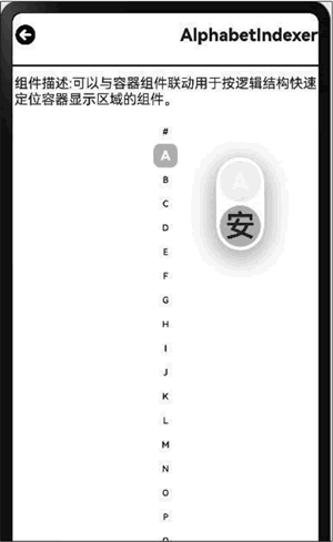
图 1 AlphabetIndexer 组件的效果 1
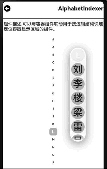
图 2 AlphabetIndexer 组件的效果 2
示例代码如下:
import { router } from '@kit.ArkUI';
import { Navbar as MyNavbar } from '../components/NavBar'
@Entry
@Component
struct AlphabetIndexerCom {
  @State desc: string = '';
  @State title:string = ''

  private array: string[] = ['安']
  private array: string[] = ['卜', '白', '包', '毕', '丙']
  private array: string[] = ['邓', '成', '陈', '催']
  private array: string[] = ['刘', '李', '楼', '梁', '雷', '吕', '柳', '卢']
  private value: string[] = ['#', 'A', 'B', 'C', 'D', 'E', 'F', 'G',
                            'H', 'I', 'J', 'K', 'L', 'M', 'N',
                            'O', 'P', 'Q', 'R', 'S', 'T', 'U',
                            'V', 'W', 'X', 'Y', 'Z']

  // 加载页面时接收传递过来的参数
  onPageShow(): void {
    // 获取传递过来的参数对象
    const params = router.getParams() as Record<string, string>;
    // 获取传递的值
    if (params) {
      this.desc = params.desc as string
      this.title = params.value as string
    }
  }

  build() {
    Column({space:10}) {
      MyNavbar({title:this.title})
      Div({.width('100%').strokeWidth(2).color(Color.Black)}
        Text('组件描述:${this.desc}')
        Row({
          AlphabetIndexer({arrayValue:this.value , selected:0})
            .selectedColor('#ffffff')  // 选中项文本颜色
            .popupColor('#fffa0f')      // 弹出框文本颜色
            .selectedBackgroundColor('#fcccccc') // 选中项背景颜色
            .popupBackgroundColor('#D2B48C') // 弹出框背景颜色
            .usingPopup(true)          // 是否显示弹出框
            .selectedFont({ size: 16, weight: FontWeight.Bolder }) // 选中项字体样式
            .popupFont({ size: 30, weight: FontWeight.Bolder }) // 弹出框内容的字体样式
            .itemSize(28)             // 每一项的尺寸大小
            .alignStyle(IndexesAlign.Center) // 弹出框在索引条右侧弹出
            .popupSelectedColor('#00FF00') // 弹出框选中项颜色
            .popupUnselectedColor('#0000FF') // 弹出框未选中项颜色
            .popupItemFont({ size: 30, style: FontStyle.Normal })
            .popupItemBackgroundColor('#CCCCCC') // 弹出框背景颜色
            .onRequestPopupData({index: number} => {
              if (this.value[index] == 'A') {
                return this.arrayA  // 当选中A时,弹出框里面的提示文本列表显示A对应的列表arrayA,选中B、C、L时也如此
              } else if (this.value[index] == 'B') {
                return this.arrayB
              } else if (this.value[index] == 'C') {
                return this.arrayC
              } else if (this.value[index] == 'L') {
                return this.arrayL
              } else {
                return []
              }
            })
        })
      .width('100%')
      .height('100%')
    }
  }
}
AlphabetIndexer 接收一个对象作为属性,这个对象包含了 arrayValue 和 selected 两个属性,其中:
- arrayValue:字母索引字符串数组,不可设置为空。
- selected:初始选中项索引值,若超出索引值范围,则取默认值 0。
关于 AlphabetIndexer 的属性可以参考案例中的注释。效果如图 1 和图 2 所示。
图 1 AlphabetIndexer 组件的效果 1
图 2 AlphabetIndexer 组件的效果 2