ArkTS Button按钮组件用法详解(附带实例)
Button(按钮)组件可以快速创建不同样式的按钮,接下来将会进行系统的讲解。
要禁用按钮,可以在组件的第二个参数中添加 stateEffect 属性。该属性表示按钮被按下时是否开启按压态显示效果,当设置为 false 时,关闭按压效果。
示例代码如下:
示例代码如下:
可以通过 controlSize 来设置按钮的大小,目前仅支持小尺寸和默认两种形式。示例代码如下:
除了 Button(label ,options) 这种写法外,还有另一种写法,如下所示:
完整的按钮示例代码如下:
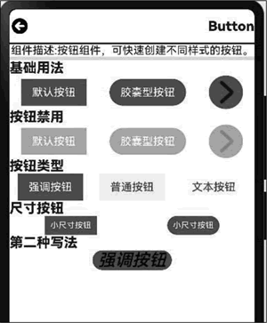
图 1 按钮效果
Button按钮的基础用法
示例代码如下:
Button('默认按钮',{type:ButtonType.Normal})
Button('胶囊型按钮',{type:ButtonType.Capsule})
Button( {type:ButtonType.Circle}){ // 原形按钮
   Image($r('app.media.iconright')).width(35)
}.width(50).height(50)
要禁用按钮,可以在组件的第二个参数中添加 stateEffect 属性。该属性表示按钮被按下时是否开启按压态显示效果,当设置为 false 时,关闭按压效果。
示例代码如下:
Button('默认按钮',{type:ButtonType.Normal , stateEffect:false}).opacity(0.4)
Button('胶囊型按钮',{type:ButtonType.Capsule , stateEffect:false}).opacity(0.4)
Button( {type:ButtonType.Circle, stateEffect:false }){ // 原形按钮
  Image($r('app.media.iconright')).width(35)
}.width(50).height(50).opacity(0.4)
opacity 属性设置的是透明度。透明度取值为 0~1,值越大越不透明,值为 1 则是完全不透明。Button按钮类型
HarmonyOS 提供了 3 种类型的按钮,分别是强调按钮(也是默认值)、普通按钮及文本按钮。在组件的第二个参数中通过 buttonStyle 来设置按钮的类型。示例代码如下:
Button('强调按钮',{type:ButtonType.Normal , buttonStyle:ButtonStyleMode.EMPHASIZED})
Button('普通按钮',{type:ButtonType.Normal , buttonStyle:ButtonStyleMode.NORMAL})
Button('文本按钮',{type:ButtonType.Normal , buttonStyle:ButtonStyleMode.TEXTUAL})
可以通过 controlSize 来设置按钮的大小,目前仅支持小尺寸和默认两种形式。示例代码如下:
Button('小尺寸按钮',{type:ButtonType.Normal , controlSize:ControlSize.SMALL})
Button('小尺寸按钮',{type:ButtonType.Capsule, controlSize:ControlSize.SMALL})
除了 Button(label ,options) 这种写法外,还有另一种写法,如下所示:
Button('强调按钮')
  .type(ButtonType.Capsule)
  .stateEffect(true)
  .buttonStyle(ButtonStyleMode.EMPHASIZED)
  .controlSize(ControlSize.SMALL)
  .fontColor('#000')
  .fontSize('25')
  .fontWeight(500)
  .fontStyle(FontStyle.Italic)
  .fontFamily('微软雅黑')
Button按钮属性
按钮的属性如下表所示,可以通过这些属性对按钮进行各种设置。| 名称 | 描述 |
|---|---|
| type |
设置 Button 样式。 默认值:ButtonType.Capsule |
| fontSize |
文本显示字号。 默认值:若 controlSize 的值为 controlSize.NORMAL,则取 '16fp';若 controlSize 的值为 controlSize.SMALL,则取 '12fp' |
| fontColor |
设置文本显示颜色。 默认值:'#ffffff' |
| fontWeight |
设置文本的字体粗细,number类型取值范围为 [100, 900],取值间隔为 100,取值越大,字体越粗。 默认值:400 | FontWeight.Normal |
| fontStyle |
设置文本的字体样式。 默认值:FontStyle.Normal |
| fontFamily | 字体列表。默认字体为 'HarmonyOS Sans' |
| stateEffect |
按钮被按下时是否开启按压态显示效果,当设置为 false 时,关闭按压效果。 默认值:true |
| labelStyle10+ | 设置 Button 组件标签文本和字体的样式 |
| buttonStyle11+ |
设置 Button 组件的样式和重要程度。 默认值:ButtonStyleMode.EMPHASIZED |
| controlSize11+ |
设置 Button 组件的尺寸。 默认值:ControlSize.NORMAL |
完整的按钮示例代码如下:
import { router } from '@kit.ArkUI';
import { Navbar as MyNavbar } from '../components/NavBar';

@Entry
@Component
struct ButtonCom {
  @State desc: string = '';
  @State title: string = '';

  // 加载页面时接收传递过来的参数
  onPageShow(): void {
    // 获取传递过来的参数对象
    const params = router.getParams() as Record<string, string>;
    // 获取传递的值
    if (params) {
      this.desc = params.desc as string;
      this.title = params.value as string;
    }
  }

  build() {
    Column() {
      MyNavbar({ title: this.title });
      Divider().width('100%').strokeWidth(2).color(Color.Black);
      Row() {
        Text(`组件描述:${this.desc}`);
      }
      Divider().width('100%').strokeWidth(5).color('#e5e5e5');

      Row() {
        Text('基础用法').fontSize(20).fontWeight(800);
      }.width('100%');

      Row() {
        // 基础用法示例
        Button('默认按钮', { type: ButtonType.Normal });
        Button('胶囊型按钮', { type: ButtonType.Capsule });
        Button({ type: ButtonType.Circle }) { // 圆形按钮
          Image($r('app.media.iconright')).width(35);
        }.width(50).height(50);
      }
      .width('100%')
      .justifyContent(FlexAlign.SpaceAround);

      Row() {
        Text('按钮禁用').fontSize(20).fontWeight(800);
      }.width('100%');

      Row() {
        // 禁用状态示例
        Button('默认按钮', { type: ButtonType.Normal, stateEffect: false }).opacity(0.4);
        Button('胶囊型按钮', { type: ButtonType.Capsule, stateEffect: false }).opacity(0.4);
        Button({ type: ButtonType.Circle, stateEffect: false }) { // 圆形按钮
          Image($r('app.media.iconright')).width(35);
        }.width(50).height(50).opacity(0.4);
      }
      .width('100%')
      .justifyContent(FlexAlign.SpaceAround);

      Row() {
        Text('按钮类型').fontSize(20).fontWeight(800);
      }.width('100%');

      Row() {
        // 不同风格按钮
        Button('强调按钮', {
          type: ButtonType.Normal,
          buttonStyle: ButtonStyleMode.EMPHASIZED
        });
        Button('普通按钮', {
          type: ButtonType.Normal,
          buttonStyle: ButtonStyleMode.NORMAL
        });
        Button('文本按钮', {
          type: ButtonType.Normal,
          buttonStyle: ButtonStyleMode.TEXTUAL
        });
      }
      .width('100%')
      .justifyContent(FlexAlign.SpaceAround);

      Row() {
        Text('尺寸按钮').fontSize(20).fontWeight(800);
      }.width('100%');

      Row() {
        // 小尺寸按钮
        Button('小尺寸按钮', {
          type: ButtonType.Normal,
          controlSize: ControlSize.SMALL
        });
        Button('小尺寸按钮', {
          type: ButtonType.Capsule,
          controlSize: ControlSize.SMALL
        });
      }
      .width('100%')
      .justifyContent(FlexAlign.SpaceAround);

      Row() {
        Text('第二种写法').fontSize(20).fontWeight(800);
      }.width('100%');

      Row() {
        // 链式写法示例
        Button('强调按钮')
          .type(ButtonType.Capsule)
          .stateEffect(true)
          .buttonStyle(ButtonStyleMode.EMPHASIZED)
          .controlSize(ControlSize.SMALL)
          .fontColor('#000')
          .fontSize('25fp')
          .fontWeight(500)
          .fontStyle(FontStyle.Italic)
          .fontFamily('微软雅黑');
      }
      .width('100%')
      .justifyContent(FlexAlign.SpaceAround);
    }
    .width('100%')
    .height('100%');
  }
}
示例效果如下图所示:图 1 按钮效果
 ICP备案:
 公安联网备案: