ArkTS CalendarPicker日历组件的用法(附带实例)
CalendarPicker(日历选择器)组件提供下拉日历弹窗,可以让用户选择日期。
CalendarPicker 组件可以通过 edgeAlign 和 textStyle 来设置日历选择器的属性,具有以下功能:
一个基础日历选择器的示例代码如下:
在开发过程中,通常会添加 onChange 事件,以便在选择日期时触发该事件。
CalendarPicker 组件的完整代码如下:
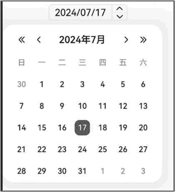
图 1 CalendarPicker组件的效果
CalendarPicker 组件可以通过 edgeAlign 和 textStyle 来设置日历选择器的属性,具有以下功能:
- edgeAlign:设置选择器与入口组件的对齐方式;
- -alignType:对齐方式类型,默认值为 CalendarAlign .END;
- -offset:表示按照对齐类型对齐后,选择器相对入口组件的偏移量。默认值为 {dx: 0, dy: 0};
- textStyle:设置入口区的文本颜色、字号、字体粗细。
一个基础日历选择器的示例代码如下:
CalendarPicker({ hintRadius: 10, selected: this.selectedDate })
  .edgeAlign(CalendarAlign.END)
  .textStyle({ color: "#ff182431", font: { size: 20, weight: FontWeight.Normal } })
  .margin(10)
  .onChange((value) => {
    console.info("CalendarPicker onChange:" + JSON.stringify(value))
  })
在上述代码中:
-
hintRadius:描述日期选中态底板样式,默认样式为圆形。
- hintRadius 为 0,底板样式为直角矩形;
- hintRadius 为 0 ~ 16,底板样式为圆角矩形;
- hintRadius≥16,底板样式为圆形。
- selected:设置选中项的日期。选中的日期未设置或日期格式不符合规范,则为默认值。默认值为当前系统日期。
在开发过程中,通常会添加 onChange 事件,以便在选择日期时触发该事件。
CalendarPicker 组件的完整代码如下:
import { router } from '@kit.ArkUI';
import { Navbar as MyNavbar } from '../components/NavBar';

@Entry
@Component
struct CalendarPickerCom {
  @State desc: string = '';
  @State title: string = '';

  private selectedDate: Date = new Date();

  // 加载页面时接收传递过来的参数
  onPageShow(): void {
    // 获取传递过来的参数对象
    const params = router.getParams() as Record<string, string>;
    // 获取传递的值
    if (params) {
      this.desc = params.desc as string;
      this.title = params.value as string;
    }
  }

  build() {
    Column() {
      MyNavbar({ title: this.title });
      Divider().width('100%').strokeWidth(2).color(Color.Black);

      Row() {
        Text(`组件描述:${this.desc}`);
      }
      Divider().width('100%').strokeWidth(5).color('#e5e5e5');

      Row() {
        Text('日期选择器')
          .fontSize('20fp')
          .fontWeight(800);
      }
      .justifyContent(FlexAlign.Start)
      .width('100%');

      Row() {
        Text('hintRadius为10,设置选择器与入口组件右对齐的对齐方式。');
      }

      Row() {
        // 设置选择器与入口组件右对齐的对齐方式
        CalendarPicker({
          hintRadius: 10,
          selected: this.selectedDate
        })
          .edgeAlign(CalendarAlign.END)
          .textStyle({
            color: '#ff182431',
            font: { size: 20, weight: FontWeight.Normal }
          })
          .margin(10)
          .onChange((value: Date) => {
            console.info('CalendarPicker onChange: ' + JSON.stringify(value));
          });
      }
      .width('100%')
      .justifyContent(FlexAlign.End)
    }
    .width('100%')
    .height('100%');
  }
}
CalendarPicker 组件的示例效果如下图所示:图 1 CalendarPicker组件的效果